

Roman Kamushken
UI design to improve
Once a friend of mine asked me "Can somebody cook a better burger than McDonald's does?", "Nope" — I've suddenly answered. And this was a totally incorrect answer. You can produce it tastier, but you can't sell it strongly than MCD.
Can you design better than Google? Perhaps, but you don't have so much design influence, thus you can't dictate the design rules louder than Google.
Since the last Google Material Design retouching (passed slightly all over 2018 and still continues) — overall UI surface became better than before. Theming was officially declared in GMD. We tried to mix global styles with some little details to compose a hi-end material theme for web and mobile.
We at Setproduct still don't have so much influence in the design world, but we don't hesitate to try to bring our own design vision through Material-UI library to create a custom Material Design Theme for ReactJS.
Let's start from the Buttons section and get ready to take a walkthrough over each small detail in every button from the material library:
Default Buttons
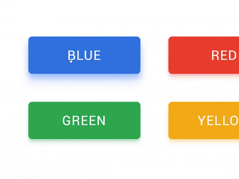
There's almost nothing to enhance in ordinary Filled buttons except the shadow. The first improvement we did to our library is reflecting the colorful shadow from an object with the same fill. Like a colored object on a white surface in a real world. We keep 4 primary colors in our design system, the same for shadow styles.
Buttons served in 4 styles: Filled, Smooth, Ghost & Raised.
Round Buttons
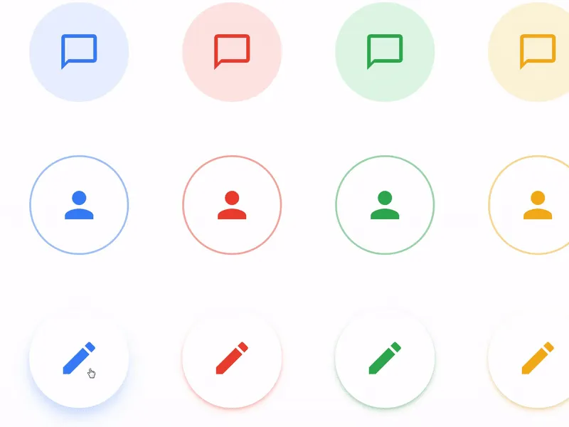
This section could be recognised as Floating Action Buttons (FAB). Due to our design tasks, we wanted to have fewer impact buttons to use for navigation or toolbar headers, but still spheric.
We expanded more styles for this sort and retouched it to look not so impact. Each type of buttons supported by custom oHover and onClick effects.
Square Buttons
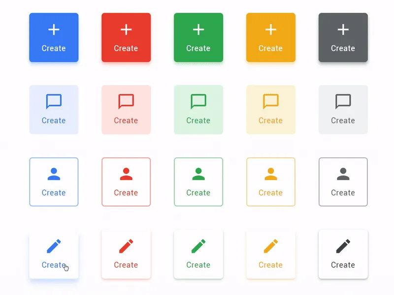
Sometimes showing just an icon and the button body is not enough to explain the further action. We made a button type which explains more by delivering a caption after an icon. Square is just a temporary name.
The longer caption you'll paste the more it will look like a rectangle. This sort of buttons fit perfect for a sidebar or navigation toolbar at the top, or even bottom (especially for desktop / web products)
Action Buttons
This sort of buttons was inspired by the new Gmail Compose button. Styled with rounded corners, wide and could be placed from Filled style for more priority or Raised for mid-prior actions in your product.
For example, Gmail UI contains only light and low elevated Action Button, despite composing a message is an extremely prior action in any email client.
We use Qucksand font in our React system instead of Product Sans, which is owned by Google. So it's a pretty compatible solution to stay legal.
We love UI details!
Setproduct is aimed to keep in order with every little UI detail in each component included in our Material React Templates kit. We've got a huge components database in our nearest plans to describe, develop and animate via ReactJS.
Our Material Design theme is supported by components system made in Figma. So, if you're ready to purchase this product - you'll be equipped with high quality design sources as well. Still hesitating? Try to play with React buttons live in your browser.


