
Material X Figma design system UI kit
Material X Figma design system UI kit. 1100+ components. Mobile & desktop templates for Material dashboards. Available for Angular.

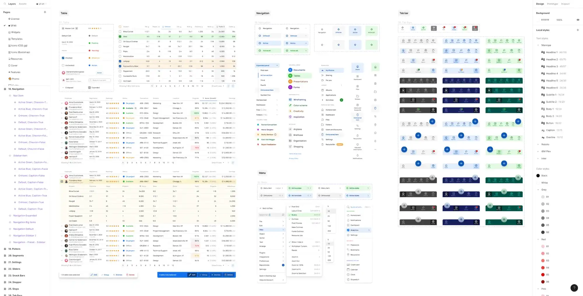
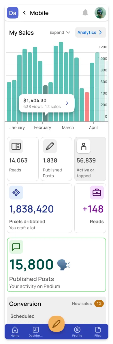
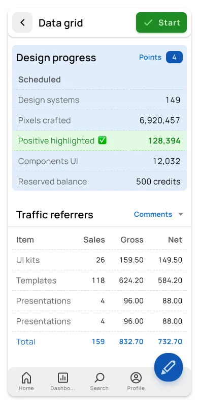
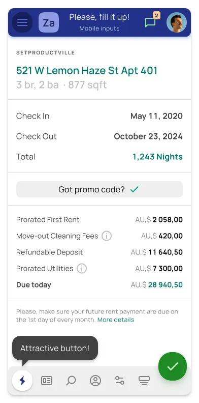
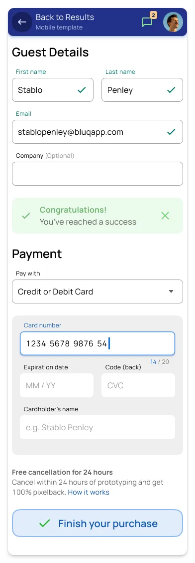
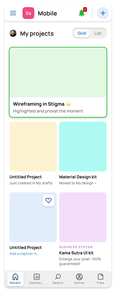
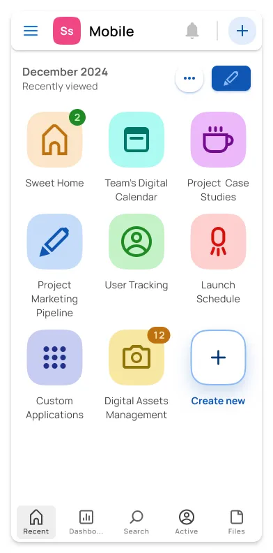
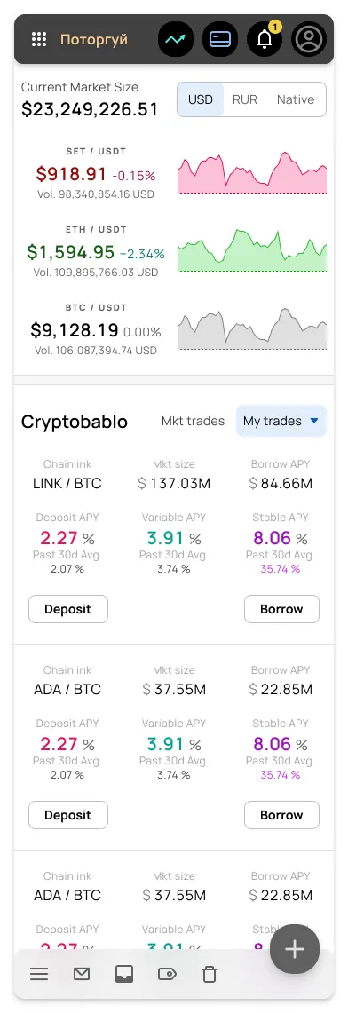
Mobile & Desktop templates
34 sections of design items for every case

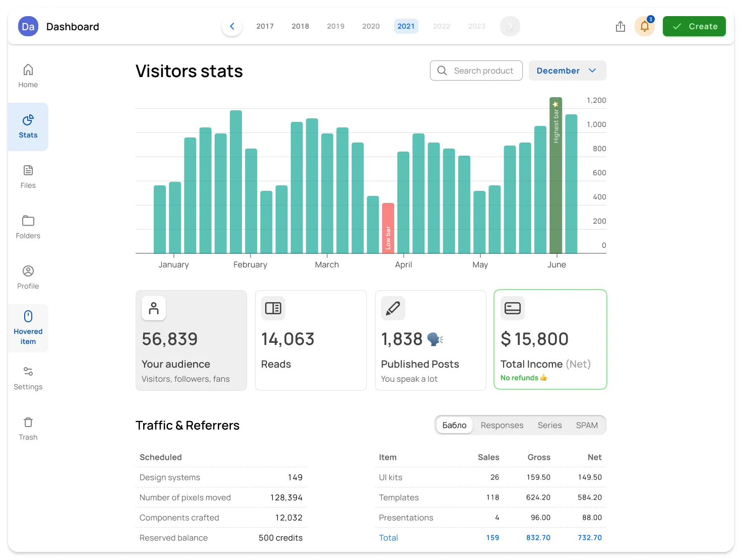
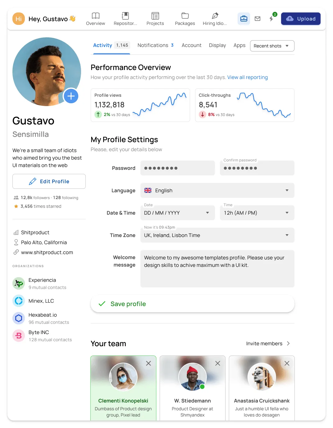
p class="heading-style-h5 is-template-max-width">Ready-to-use app templates
40 ready layouts for desktop, tablet and mobile
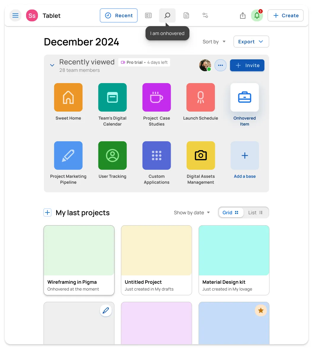
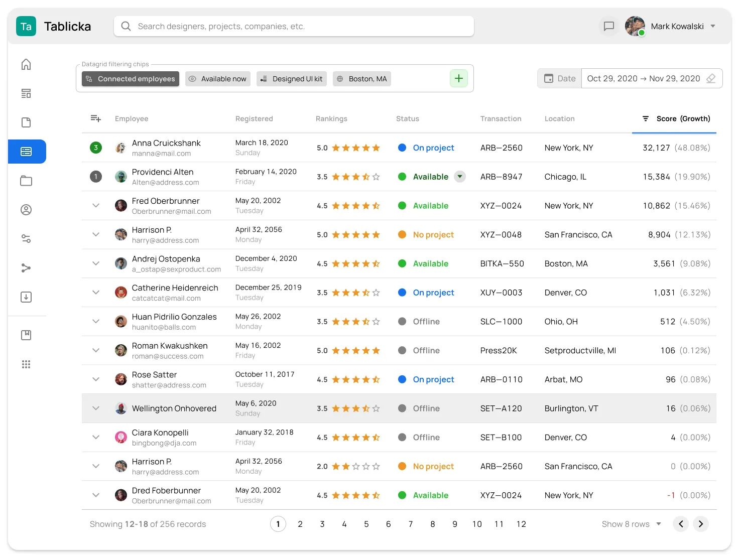
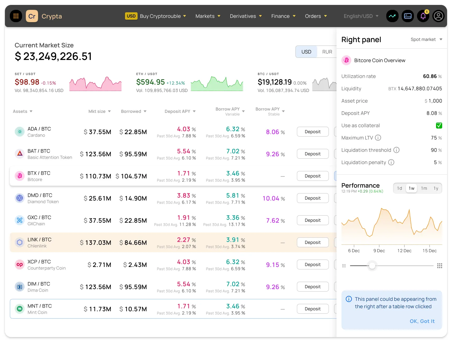
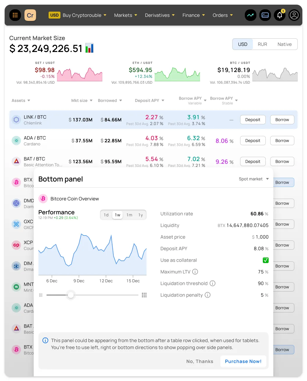
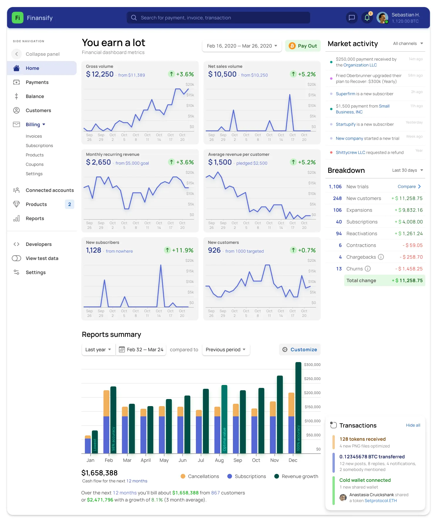
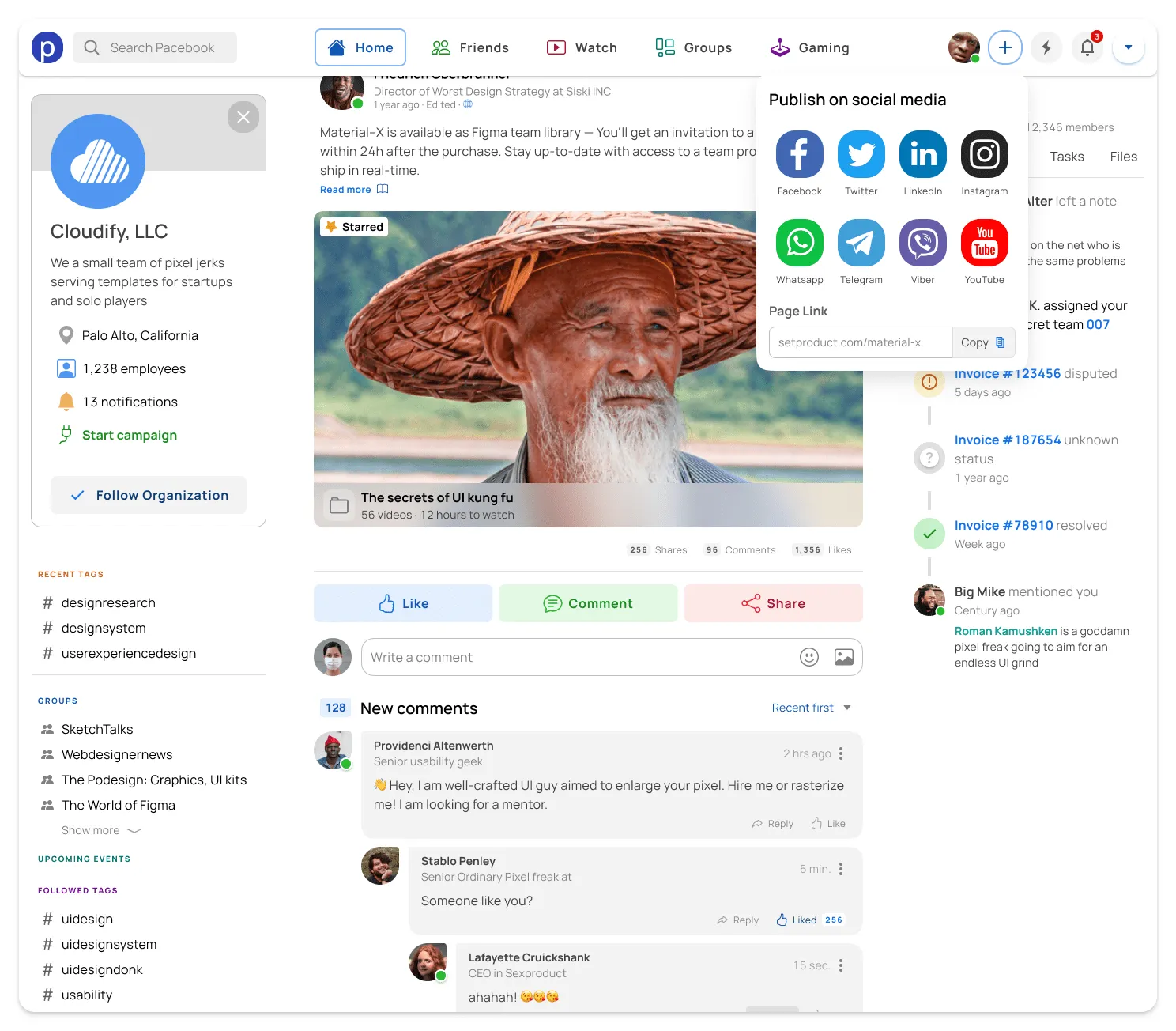
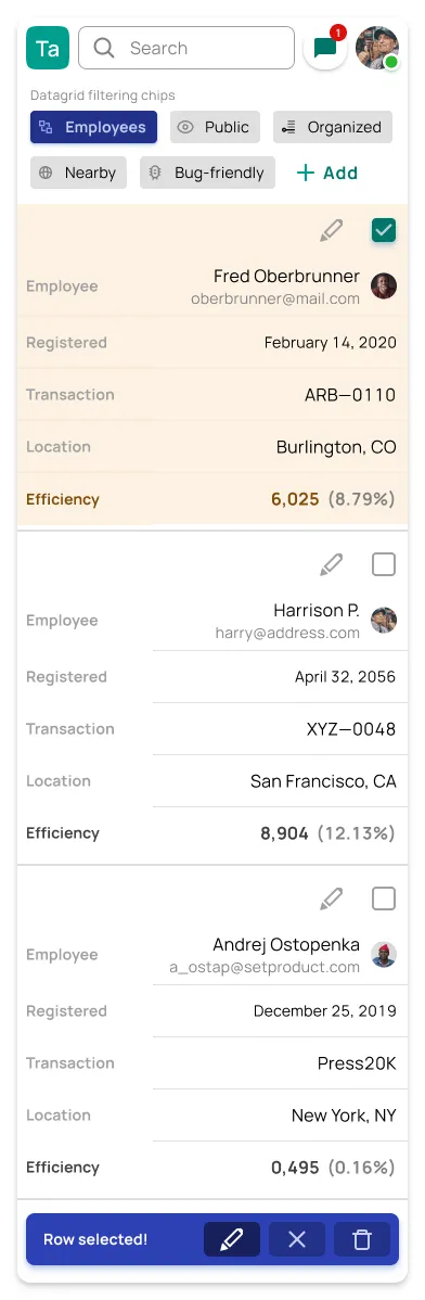
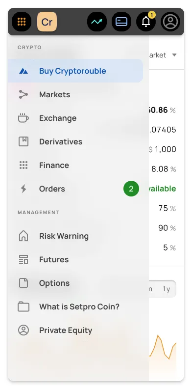
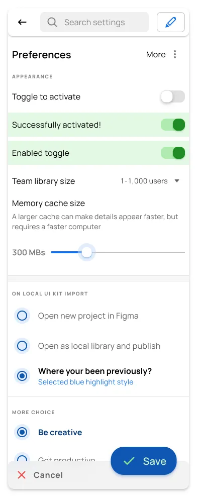
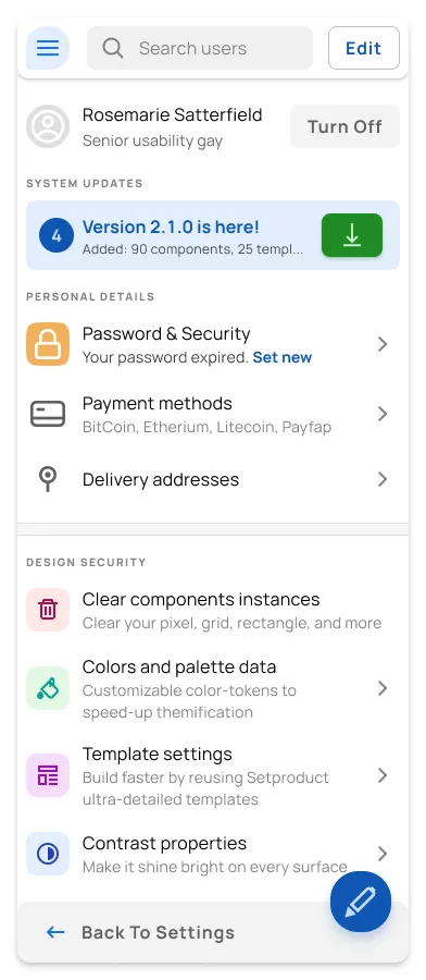
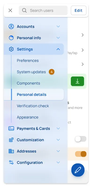
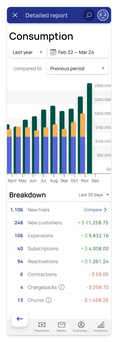
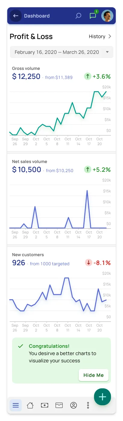
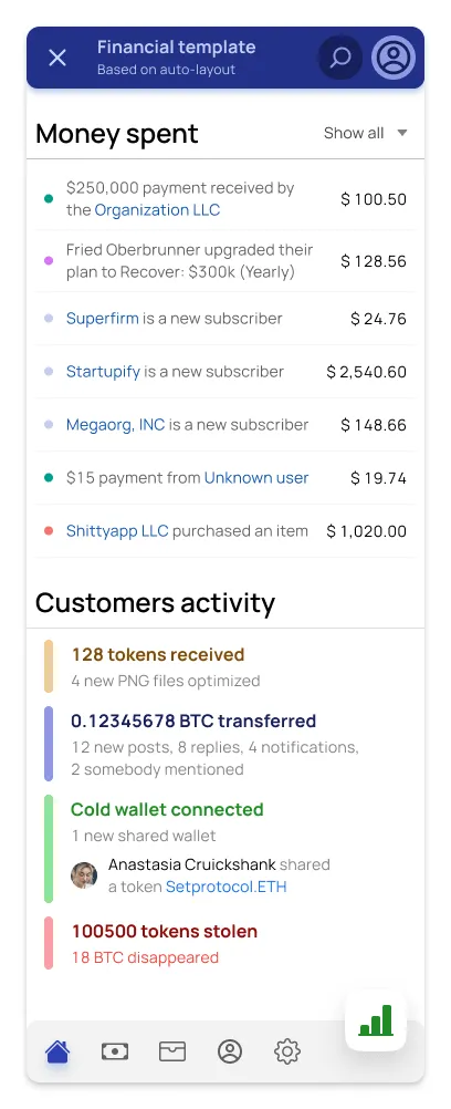
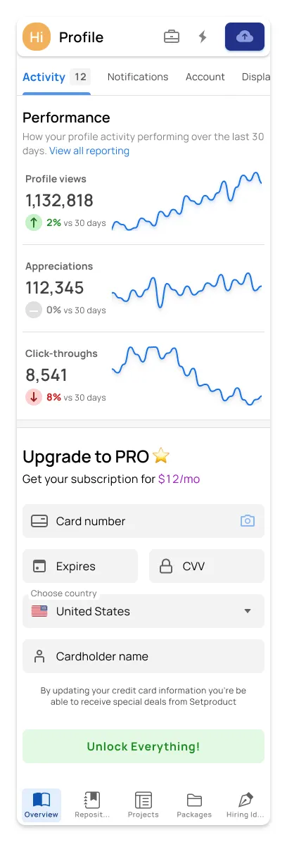
Desktop & mobile templates for Material dashboards
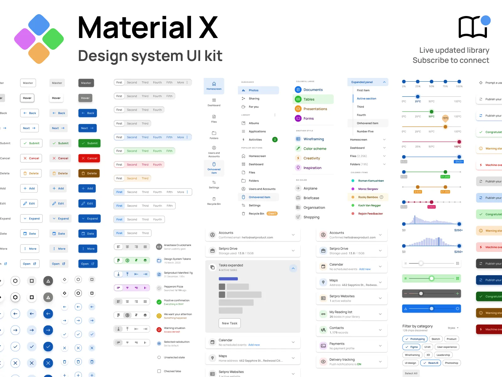
Preview 1,100+ components

Headers

Default Buttons

FAB Extended

Rectangle Buttons
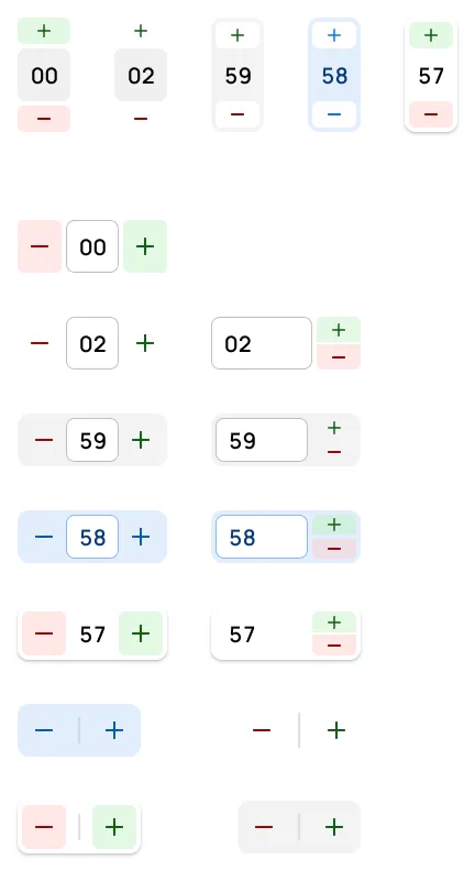
Steppers

Chips

Inputs

Input Templates

Multiselect

Segmented Controls

Tabs

Menus

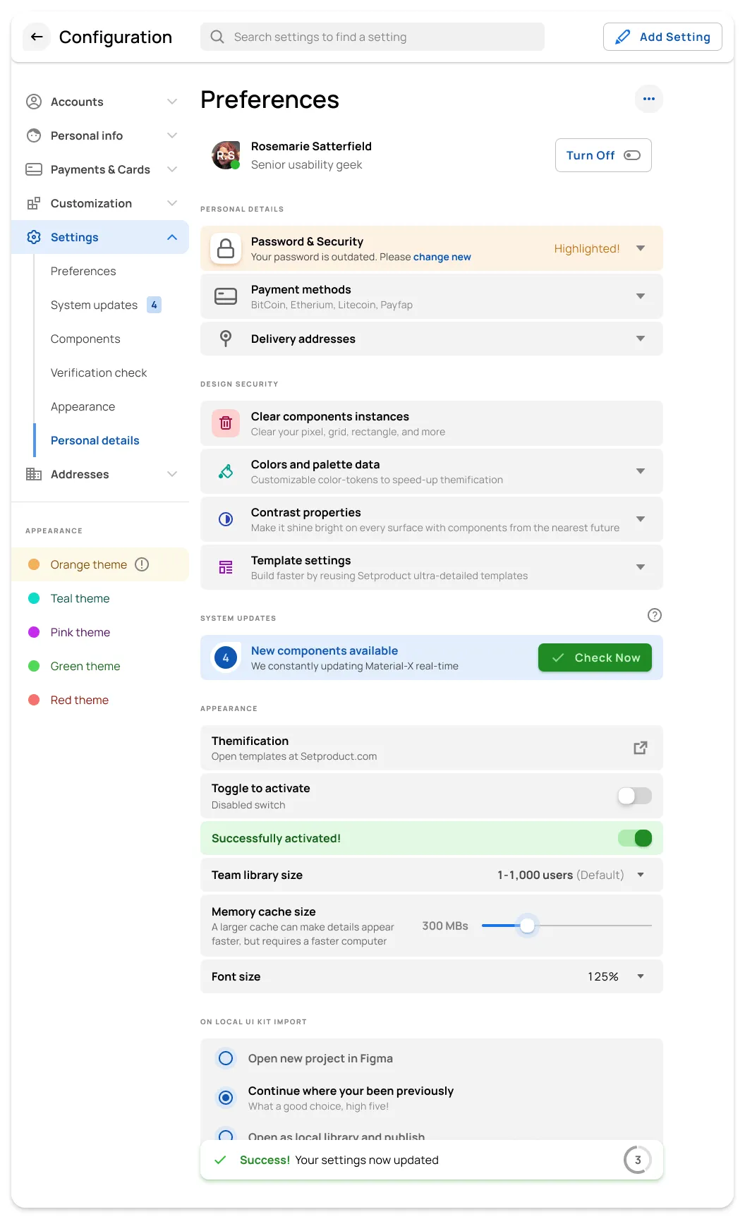
Settings

Tables

Steppers

Navigation

Application Bars

Calendars

Datepickers

Accordions

Empty States

Snack Bars

Sliders

Dialogs

Cards

Cards
Preview desktop templates
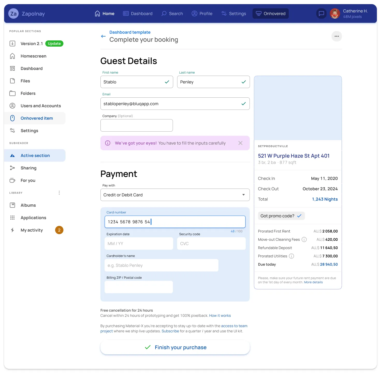
Mobile & Tablet templates
Get started⚡
Material X for Figma
1100+ components & 40 app templates beyond Material Design. Powered by top-notch shapes and Manrope font. Customizable & Adjustable UI kit.
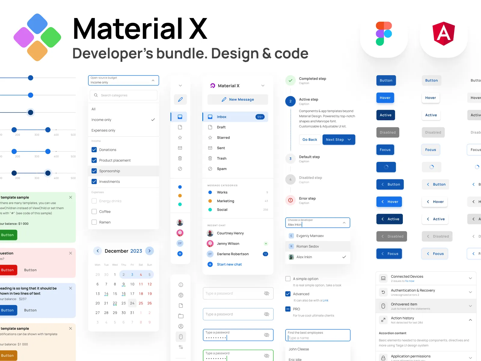
Material X for Angular
Devs library where design and features of Figma components are equal to Angular components, which helps your designers and developers to stay in sync.
Hire us to custom design & code! Let's build together ✊
FAQs
How to start with this design system?
After the successful purchase via Gumroad (it's safe and encrypted) you will be taken to a download page. You will also get the download link in your email (check the SPAM folder sometimes). Then just simply drag and drop .FIG file onto your Figma app. Do not drop it onto the project. Drop it over the starting screen with recent projects grid.
l am new to Figma. Should I try your kits?
Definitely! Our products help customers who learning Figma from scratch. By exploring and studying commercial UI kits you learn how the components and layouts were crafted, which styles being used and which styling tricks have been applied.
How to import your kits?
Importing .FIG files into Figma: https://help.figma.com/hc/en-us/articles/360041003114-Import-files-to-the-file-browser
Which license type should I choose?
You must select the proper license type according to the number of users in Figma if you're purchasing our product for the business.
Business license — for startups or enterprise organizations to use for a local team or publish in Figma library.
Individual license — for freelancers, indie developers, or solopreneurs working on a single project.
Can I build commercial proiects with your products?
Yes! You can build an unlimited amount of commercial projects using Setproduct assets. But, please, consider a license type before making a purchase.
I have a project. Can I hire you?
We're open-minded to your custom design & development projects. We can create complex templates based on our Figma libraries and code them in the production using a wide variety of popular frameworks and technologies.
If you have a project to design & develop, simply contact us describing your brief, budget, and expectations.
I 💜 Your designs, but can I have a discount?
We provide discounts for those, who scrolled to the bottom and revealed our proposal. Just drop us a message with a short story about how you plan to use our product and we will give you a ✨30% off coupon for the upcoming purchase. Please, provide a specific product name you've put your eye on.

