

Roman Kamushken
Dialogs are more than just pop-ups.
They interrupt, guide, warn, and confirm.
A well-designed dialog system ensures that users don’t get lost, make errors, or lose confidence when interacting with critical UI flows.
This guide gives you the full breakdown of how to design effective dialog windows, including destructive confirmations, error alerts, system updates, and settings modals.
We’ll analyze real-world examples generated via AI (using HiDream model available in Venice.AI) to support this spec visually. Add these images into your system, or use them to explore visual styles.
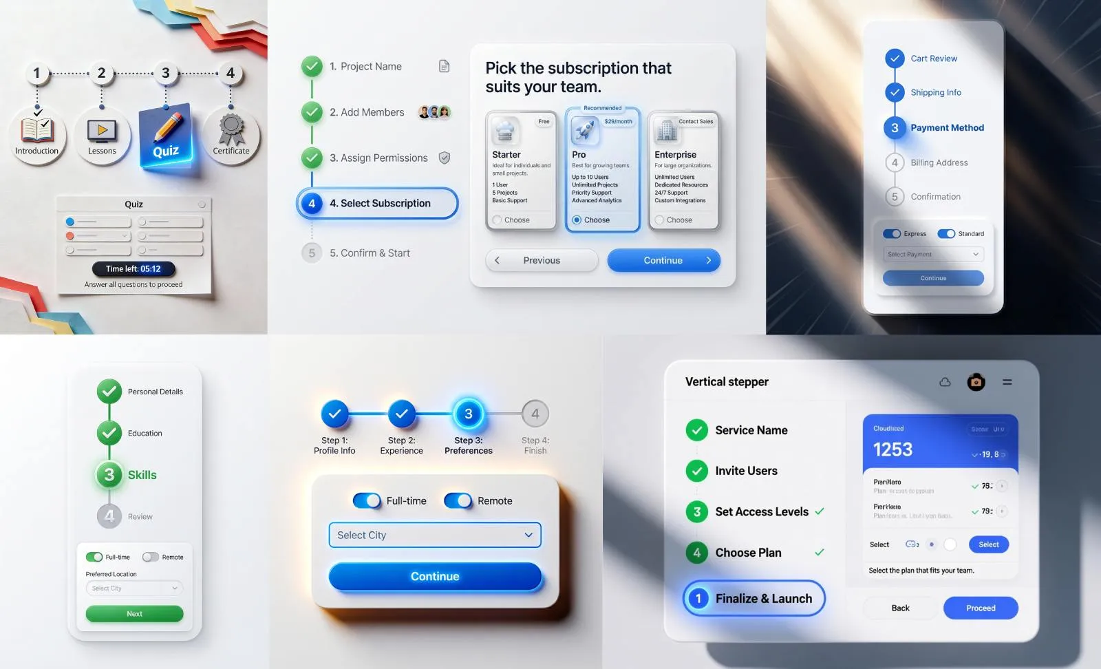
Dialog anatomy and behavior
Dialogs follow a strict anatomy to ensure familiarity and predictability.
The structure usually includes:
- Title: Clear, specific, ideally action-oriented (e.g., "Delete this item?", "System update required")
- Body text: Explains what’s happening, what’s at stake, or what the result will be
- Icon or visual: Optional, used for emotion (error, warning, success) or clarity
- Primary action: The path forward, often a confirm or continue
- Secondary action: A safe out, usually Cancel or Back
- Keyboard behavior: Escape closes non-critical dialogs; Enter triggers primary action
- Focus behavior: Trap focus within dialog while active
Modal vs modeless: when to block the UI
Modal dialogs block interaction with the parent UI until dismissed. Use when:
→ User must make a decision before continuing
→ You’re confirming a potentially destructive or irreversible action
→ Input is required to proceed
Modeless dialogs stay open without blocking the background UI (e.g., floating tool panels).
Dialogs should be dismissible via the close button or Escape key, unless confirmation is absolutely required.
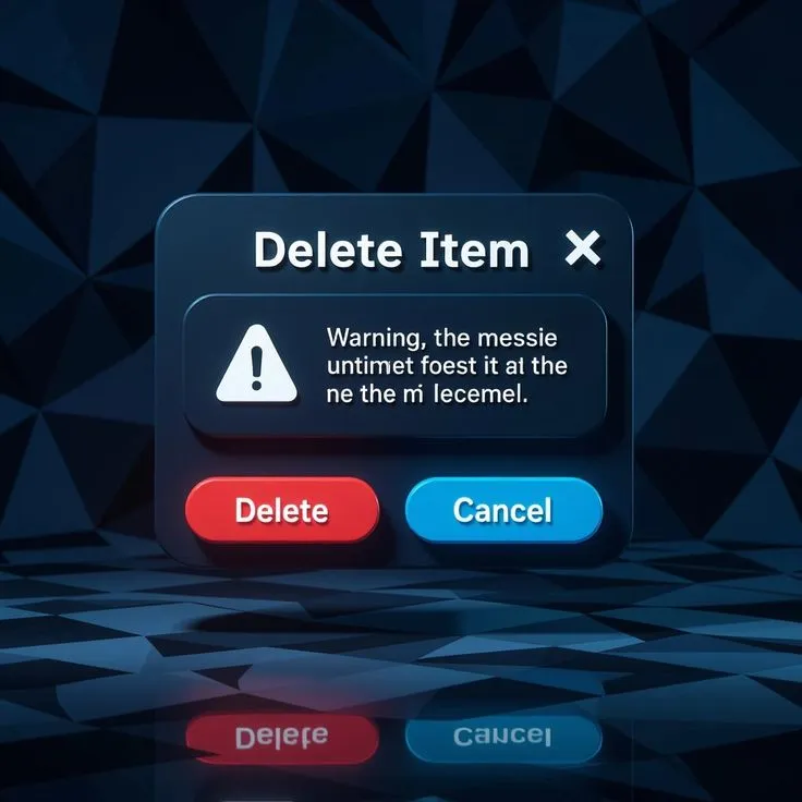
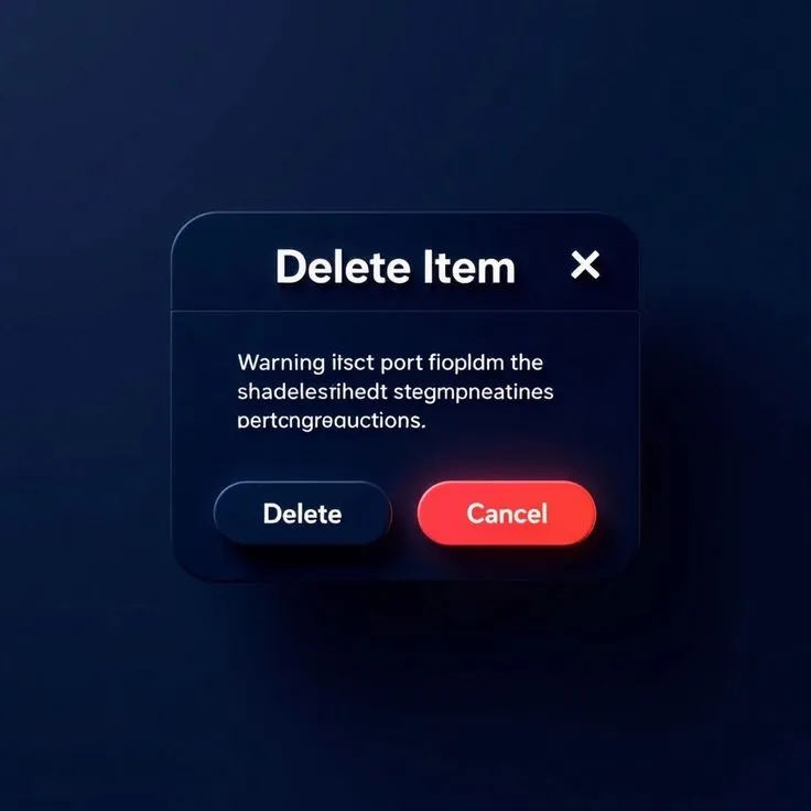
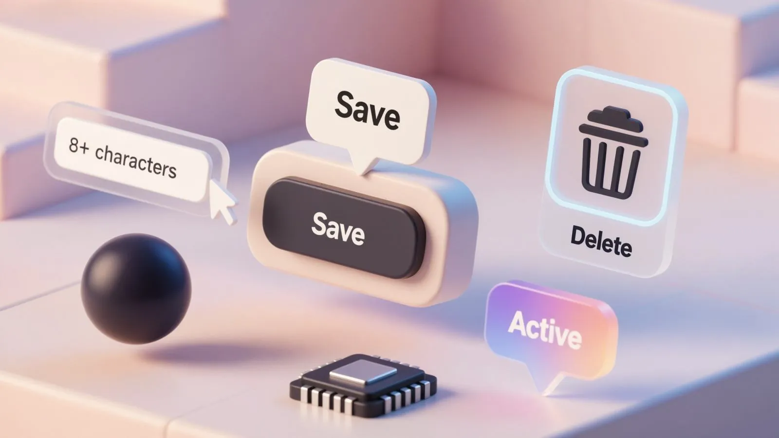
Destructive flows: safe design for dangerous actions
Destructive dialogs (e.g., delete, remove access, reset) demand special attention.
Design patterns:
☞ Use a red primary button labeled with the action: "Delete", "Remove"
☞ Pair it with a neutral secondary action: "Cancel"
☞ Include iconography (trash, alert triangle) for visual reinforcement
☞ Optional: show item name or count being affected
☞ Disable the confirm button unless checkbox is ticked ("I understand") for irreversible actions
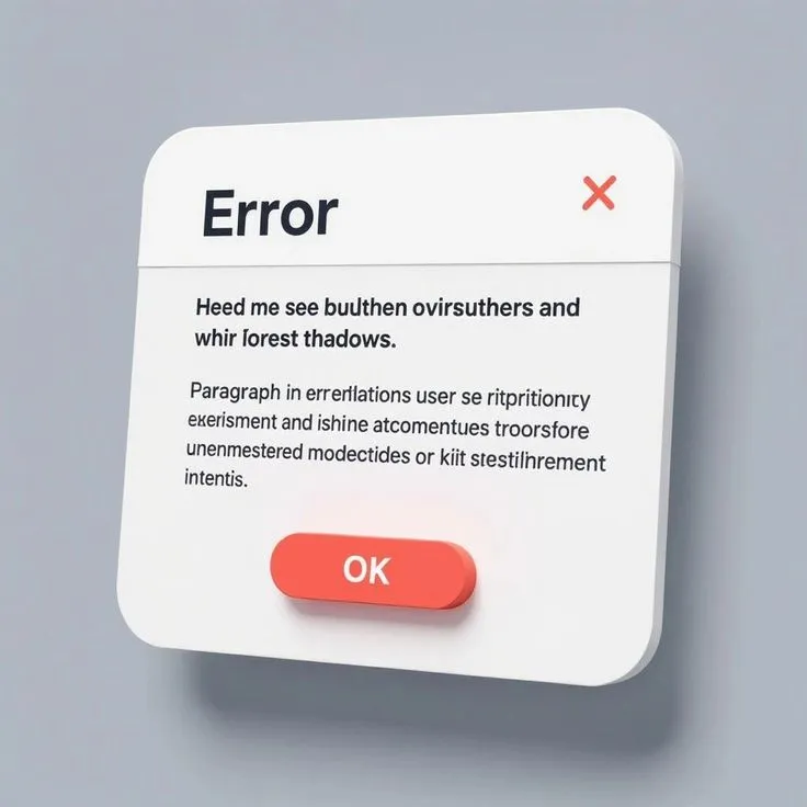
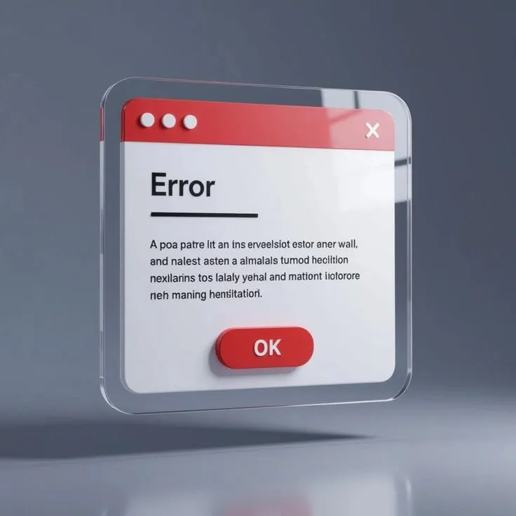
Error dialogs: recovery, not blame
Error dialogs should focus on helping the user recover.
Avoid technical language unless the context requires it (e.g., dev tools).
Best practices:
❶ Short title: "Something went wrong", "Failed to save changes"
❷ Brief explanation with one clear suggestion
❸ Include a "Try again" button if retry is possible
❹ Add a link for more details if needed (e.g., error logs)
❺ Don’t use red for the entire dialog; use color to highlight, not punish
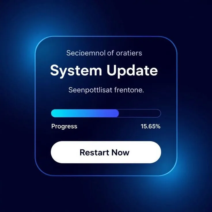
Update and progress dialogs
When your system is performing a long-running action (e.g., download, install, sync), you need a progress dialog.
Checklist for progress dialogs:
• Show a determinate progress bar when possible
• Include estimated time remaining or percentage
• Use an action verb as title: "Downloading update..."
• Disable close button if exit might corrupt progress
• Show a secondary dialog afterward: "Update complete"
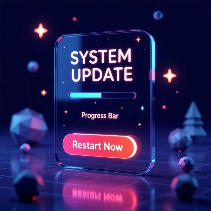
Confirmation dialogs after update
After an update completes or a system action finishes, show confirmation. Don’t just close the dialog silently.
Good practice:
→ Show a clear success icon or message
→ Offer optional actions: "Restart now", "View details"
→ Provide a visible “Dismiss” button to continue
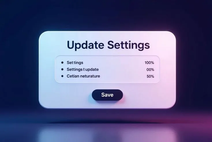
Dialogs for preferences or settings
Some dialogs aren’t about confirmations or errors : they’re used to configure small sets of preferences.
In this case:
❶ Allow multiple fields in the dialog
❷ Confirm with a clear "Save" button
❸ Include "Cancel" or "Reset" if changes can be undone
Use consistent form controls and match dialog width to expected input length.
Usability tips for dialog design
Accessible defaults → Focus on the first interactive element when dialog opens → Trap keyboard focus; restore it after close
Layout control → Align buttons right on desktop, stacked on mobile → Maintain minimum tap targets (44px)
Copywriting → Use direct, calm language → Avoid unnecessary politeness or exclamation marks
Mobile-first adjustments → Use full-width dialogs or bottom sheets → Avoid nested scroll in dialogs
Theme and style → Add elevation or backdrop blur to separate from parent UI → Use icon styles consistent with system (filled vs outlined)
FAQ: Dialog UI design
➀ Should every action be confirmed via dialog?
No. Only irreversible or sensitive actions deserve confirmation. Avoid dialog fatigue.
➁ Where should the primary button be placed?
On the right for LTR languages. On top (stacked) in mobile or for multi-line dialogs.
➂ Can dialogs be dismissed by clicking outside?
Only non-critical dialogs. For destructive actions, require explicit dismissal.
➃ What if the user loses connection during a progress dialog?
Fallback to an error dialog with recovery options ("Try again" or "Offline mode").
➄ How large should dialogs be?
Small: 320px for mobile. Medium: 480–600px for most tasks. Larger dialogs need scroll or segmentation.
➅ What if multiple dialogs stack up?
Avoid it. Collapse into a single dialog with states, or queue them.
➆ Should I use modals or drawers for settings?
Use drawers for large forms, dialogs for short single-task settings.
Appendix: Generate dialog UIs with Venice.ai
Designing dialog components for a library or product? Save time by generating polished, structure-aware layouts via AI.
We recommend Venice.ai for this purpose. It’s fast, privacy-safe, and focused specifically on UI generation — no hallucinated elements or broken structure. Unlike other models, Venice does not store your prompts or image history.
You can:
- Generate themed dialog variations in seconds
- Create visual references for specs or moodboards
- Iterate across styles (minimal, glass, skeuo) without redrawing
Try Venice.ai here → and use it as your design assistant for ideation, spec writing, or inspiration.


