

Roman Kamushken
Designers and founders often understand the basics of web design.
Grids, contrast, white space - all that stuff. But when it’s time to build a real landing page, the moment they finish the hero section… boom.
Brain freeze. What comes next?
If you’ve ever hit that wall, this guide will help. I’ve been building landing pages for startups, MVPs, and solo makers for over a decade, and I’m going to show you a structure that works. Every time.
The goal here isn’t just to make a pretty page. It’s to tell a story that gets people to care, understand, and act.
Whether you’re pre-launch, just launched, or trying to fix a broken funnel, this framework will give you a solid base to work from.
Start with the stuff every landing page needs
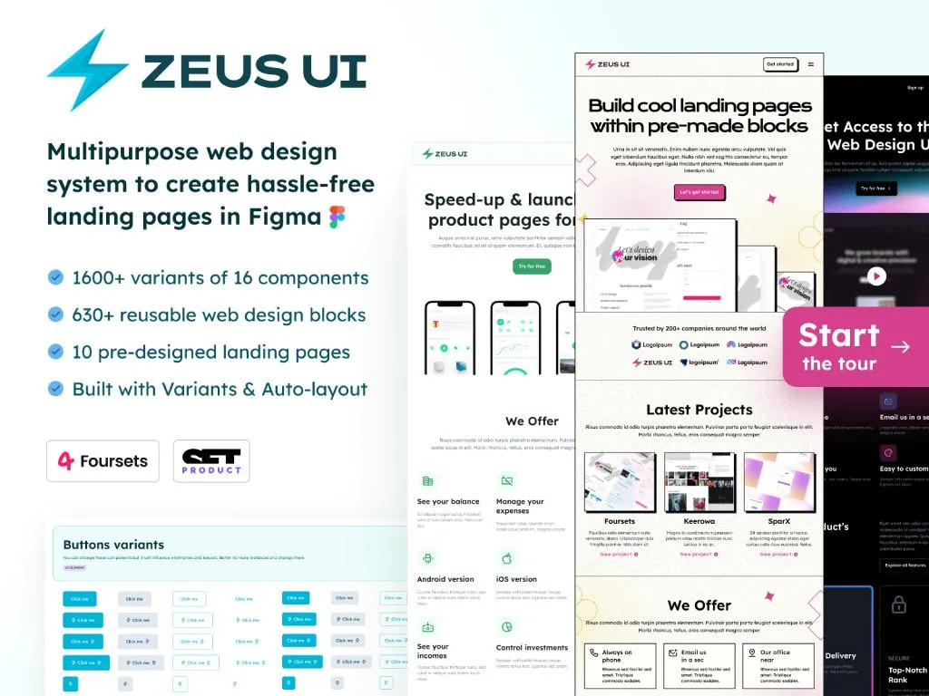
We just launched Figma web design templates to create hassle-free websites faster. It contains every possible section you need (more than 600 editable blocks included)
Every landing page, no matter the product, market, or startup stage, includes three default elements: a navbar, a hero section, and a footer.
These are your constants. They frame your layout and give the page structure. Treat them like scaffolding before you build the real house.
The hero section often includes quick social proof. It can show logos of companies using your product or short press mentions. Keep it subtle. Don’t let it overpower the actual message of what your product does.
Do: use a clean, fixed navbar that stays minimal and functional. Start your hero section with one clear sentence about your product, followed by a direct call-to-action. If you have client logos or integrations to display, this is the spot.
Don't: overload the navbar with too many links or dropdowns. Avoid vague slogans like “Revolutionize your workflow.” Instead, explain what your product does in plain language. And never forget mobile responsiveness. Many users will visit on a phone.
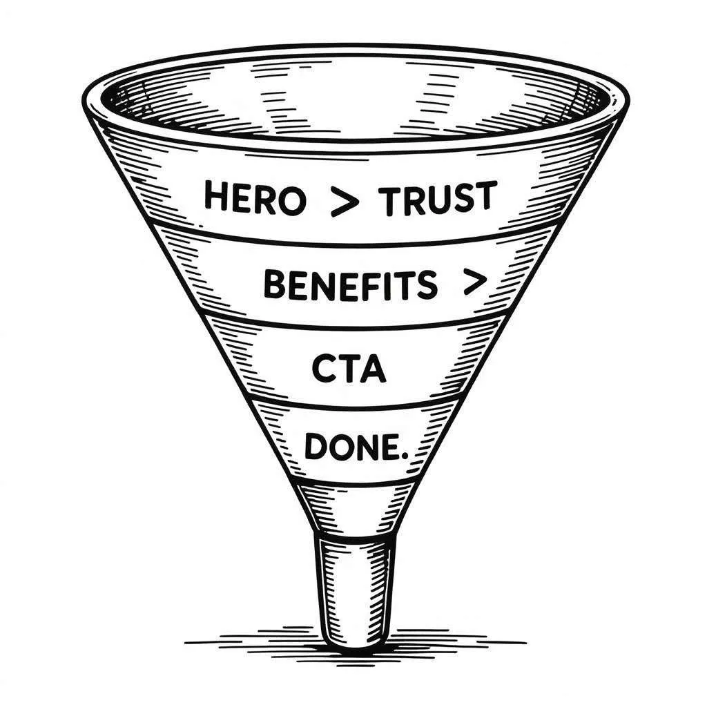
Use the EPRC method to shape your landing page
Here’s the method I use every time I build or review a landing page. EPRC. It stands for Exposition, Process, Results, and Call to action. That’s the flow. In that order.
You’re basically telling a story. One that starts with “here’s what this thing is.” Then moves into “here’s how it works.” Then “here’s proof it actually delivers.” And finally “here’s where you sign up or buy.”
Keep that story arc in mind while laying things out. It helps you avoid building a frankenpage out of random content blocks.
Exposition - Tell people what your product is and what it does
This is where people first learn what you’re offering. You can stack a few different types of sections here depending on what you’re building.
Some examples that work well:
- A features breakdown
- A short explainer video
- Some interesting product stats
- Maybe a portfolio or example use case
If your product is visual (like design tools or AI image apps), screenshots help. If it’s more abstract (like an API or backend tool), use diagrams or analogies.
✅ Keep it focused. Show the main benefits, not every feature you’ve ever built
❌ Don’t drop 10 modules with dense text. Nobody reads that
Process - Explain how it works
If your product takes a few steps to get started, or needs a bit of onboarding, this section is a lifesaver. People want to feel confident before they click.
You can include:
- A simple “how it works” diagram
- A quick tutorial video
- A visual walkthrough
- Even a few steps with icons
✅ Break things down into simple, visual chunks
❌ Don’t expect people to read through a help article mid-scroll
Results - Show what people get when they use it
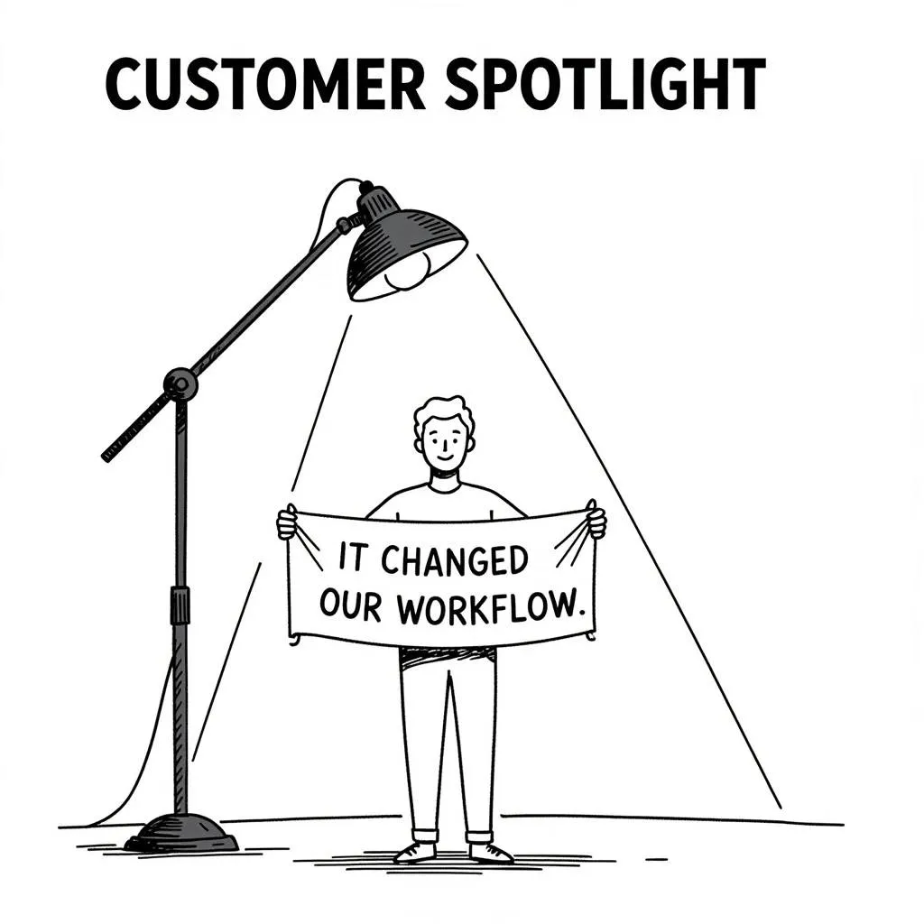
Here’s where you show outcomes. What happens when someone uses your product? What kind of success do they have?
This can be:
- Testimonials
- A before/after comparison
- Performance graphs
- Real use cases or outputs
✅ Use real examples and honest testimonials
❌ Avoid fake quotes or stock avatars. People can tell
Call to action - Make it easy to act
This is where you invite people to do something. Try, sign up, book a call, whatever the goal is.
Make it obvious, and repeat it.
Now, here’s a trick I always use: put your CTA in two places. Once inside or immediately after the hero section, And once at the very end of the page
Some visitors already know what you do. They just need the button. Don’t make them scroll through explainer videos. Others need the full story - so the second CTA is for them.
✅ Make it one strong ask: “Start free trial” or “Book demo”
❌ Don’t give five options that compete with each other
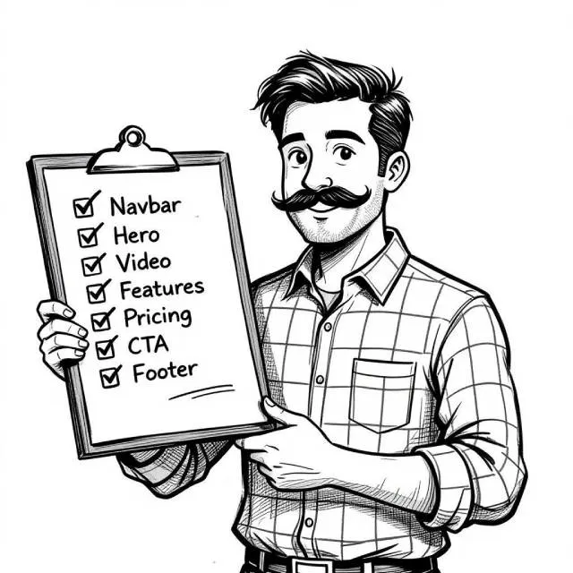
Sample of layout structure that works almost every time
If you're still unsure how to arrange things, here’s a layout I keep coming back to.
It works great for MVPs, SaaS products, indie tools, and even personal portfolios:
- Navbar
- Hero section with strong one-liner and CTA
- Explainer video or product screenshot
- Key features section
- “How it works” walkthrough
- Testimonials or client logos
- Pricing table or signup CTA
- Footer
You don’t need more unless there’s a really good reason.
Every section should earn its spot. If you’re adding things just because you saw them on another site, pause. Ask if it actually helps tell your story.
Quick note to startup founders without a UX background
If you’ve just launched your MVP or you're about to push a landing page live - there’s a good chance you missed something.
It might be a visual inconsistency, a clunky flow, unclear wording, or a CTA that doesn’t stand out. I’ve seen all of these - even on well-funded startups.
I offer a service where I personally review your startup landing page, MVP, or newly launched app. I’ll look at: UX clarity, Design leaks, Layout friction, CTA strength, Color and typography balance, and more
If you’re not sure where the leaks are (but you know something’s off) send your link to hello@setproduct.com.
I’ll take a look and send back clear, actionable feedback you can apply right away.


