

Roman Kamushken
This documentation provides an exhaustive guide to designing effective Tabs UI components. It explores anatomical elements, interaction states, theming strategies, and real-world applications - all while prioritizing usability and accessibility.
Designers and developers will learn to create tab systems that balance visual appeal with functional precision.
Tabs – are navigation elements that organize content into separate views without reloading the page. They allow users to switch between related contexts while maintaining mental context.
They solve spatial constraints by vertically/horizontally stacking contextual sections while maintaining rapid navigational access.
Unlike dropdowns, tabs persistently expose available categories, reducing cognitive load through constant visual hierarchy.
TL;DR. A tab lets people switch between related views in the same space without losing their place. Use a tabbed interface when sections are peers, fit on one row, and only one is visible at a time — not for sequential steps (use steps) or rarely-used options (use a dropdown). Below: tab anatomy, every interaction state, theming, accessible keyboard patterns, and real examples you can copy.
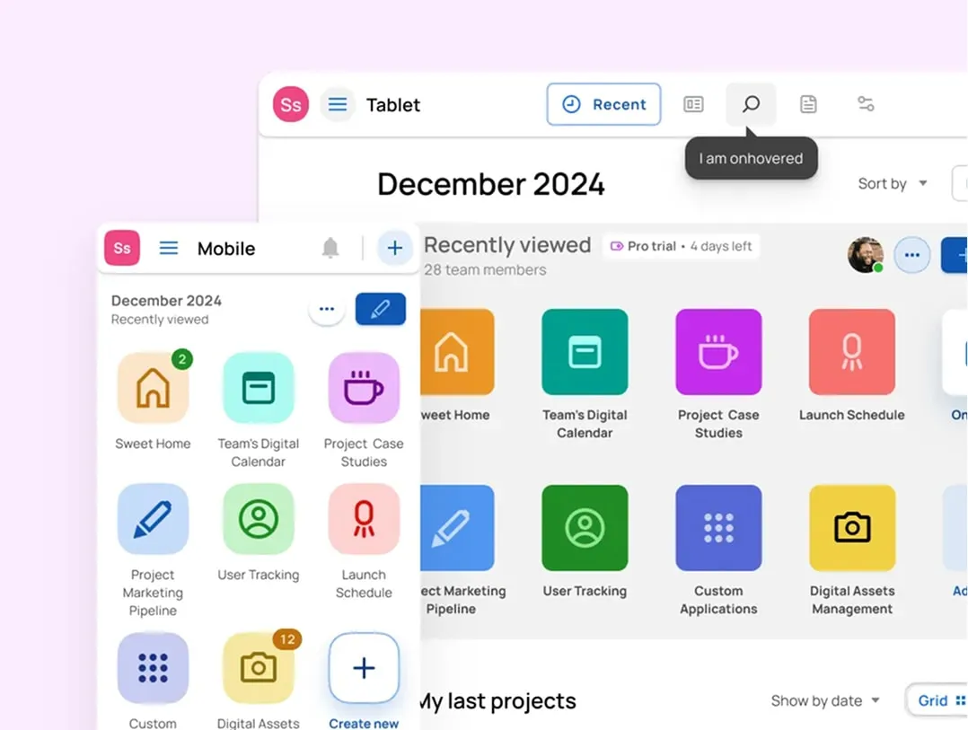
Tabs anatomy
Container
The container is the wrapper holding every tab and its content panel. It sets the spatial boundaries and signals the relationship between active and inactive states. Give it subtle background differentiation from the surrounding UI: on the web a hairline border or a faint fill is usually enough, while mobile apps tend to look better with full-bleed containers that adapt their height to the content.
Active tab
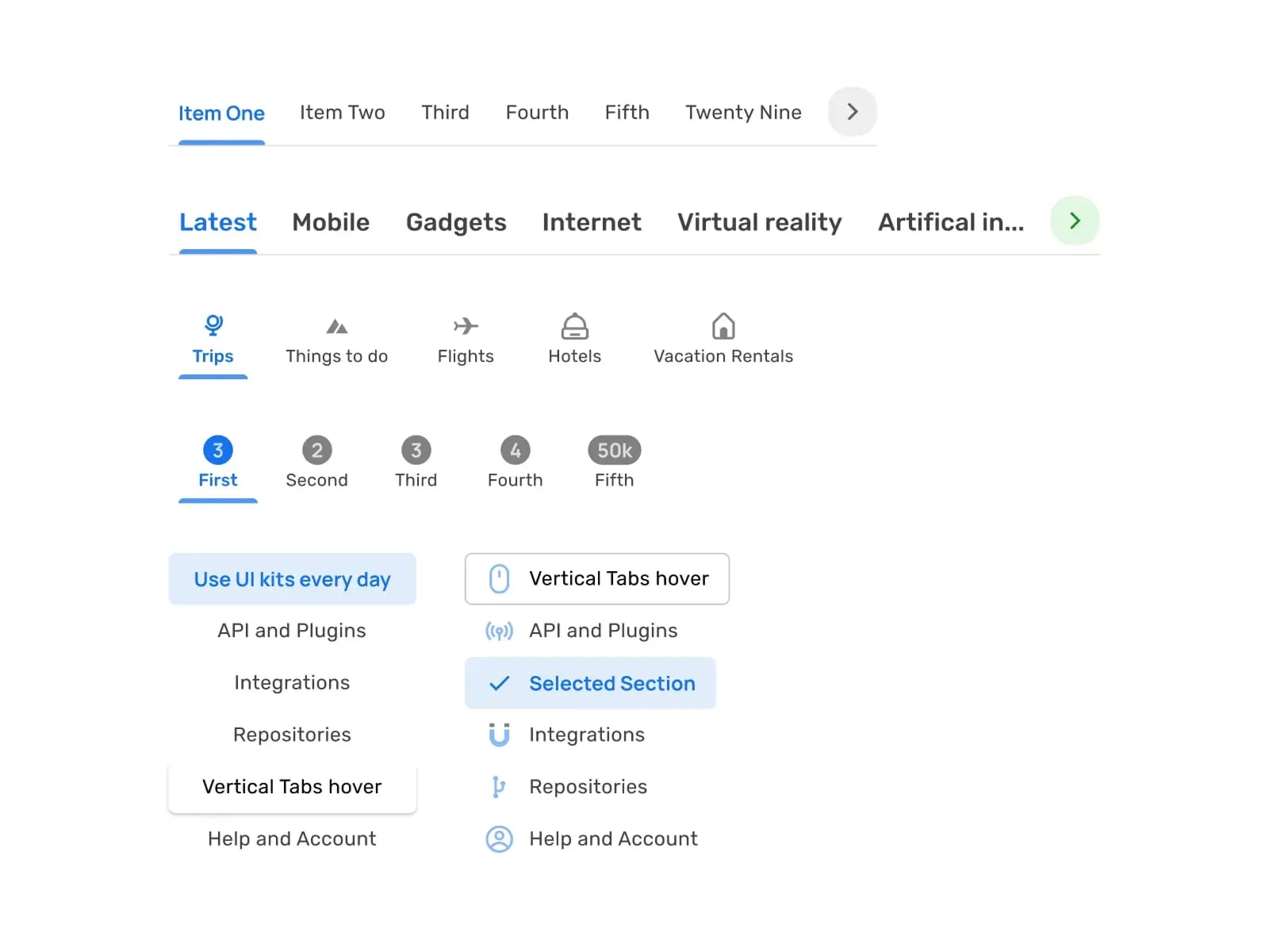
Tabs components included in Material-X UI kit for Figma
The active tab is the currently selected element and the content pane tied to it. It should carry clearly higher visual weight than its neighbors, usually by stacking a few signals at once: a heavier label, an accent indicator, and a fill or border shift. The common mistake is overdoing all three, which makes the whole bar feel like it's vibrating. A short, smooth transition that lets the indicator grow into place instead of snapping keeps the emphasis calm.
Inactive tabs
Inactive tabs are everything not currently selected, sitting there waiting for a click. Keep them noticeably lower in contrast than the active tab, and let hover lift them only part-way, never all the way to the selected styling, so the difference stays readable. Hold consistent 4-8px spacing between labels and container edges, and never let a tab shrink below 80px: truncate the label with an ellipsis instead.
Icons (optional)
Icons should track the tab's state. Outlined glyphs at a slightly muted opacity read as inactive; on activation, morph them to filled variants with a quick, smooth transition. If an icon isn't self-explanatory, back it up with a tooltip that appears after a 400ms hover, and disable that tooltip on touch devices.
Labels
Different Tabs styles and variations by Praveen Juge
Set active labels in a medium weight (500-600) and inactive ones in regular (400). Don't compress the typeface to make things fit: keep at least 2px of tracking. And plan for translation. German labels run about 30% longer than English, so give containers roughly a 20% width buffer for text expansion.
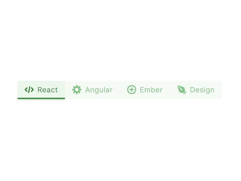
Indicator
The indicator is the visual marker for the active selection, most often an underline or highlight. Give it natural, spring-like motion as it travels between tabs; flat linear easing feels mechanical. On the implementation side, CSS transform: scaleX() animates more smoothly than transitioning width.
Scroll controls
Scroll controls are the arrows or chevrons that move you through tabs overflowing the available space, mostly a responsive-layout problem. Reveal them only on hover to cut visual noise, sitting around 45% opacity at rest and lifting to 90% on hover. On touch devices, add swipe gestures but keep the arrows too: a good share of people still look for them.
Content pane
Hold the vertical scroll position steady when someone switches tabs: a sudden jump is disorienting. For heavy content, show a skeleton screen while it loads rather than leaving a blank pane staring back at the reader.
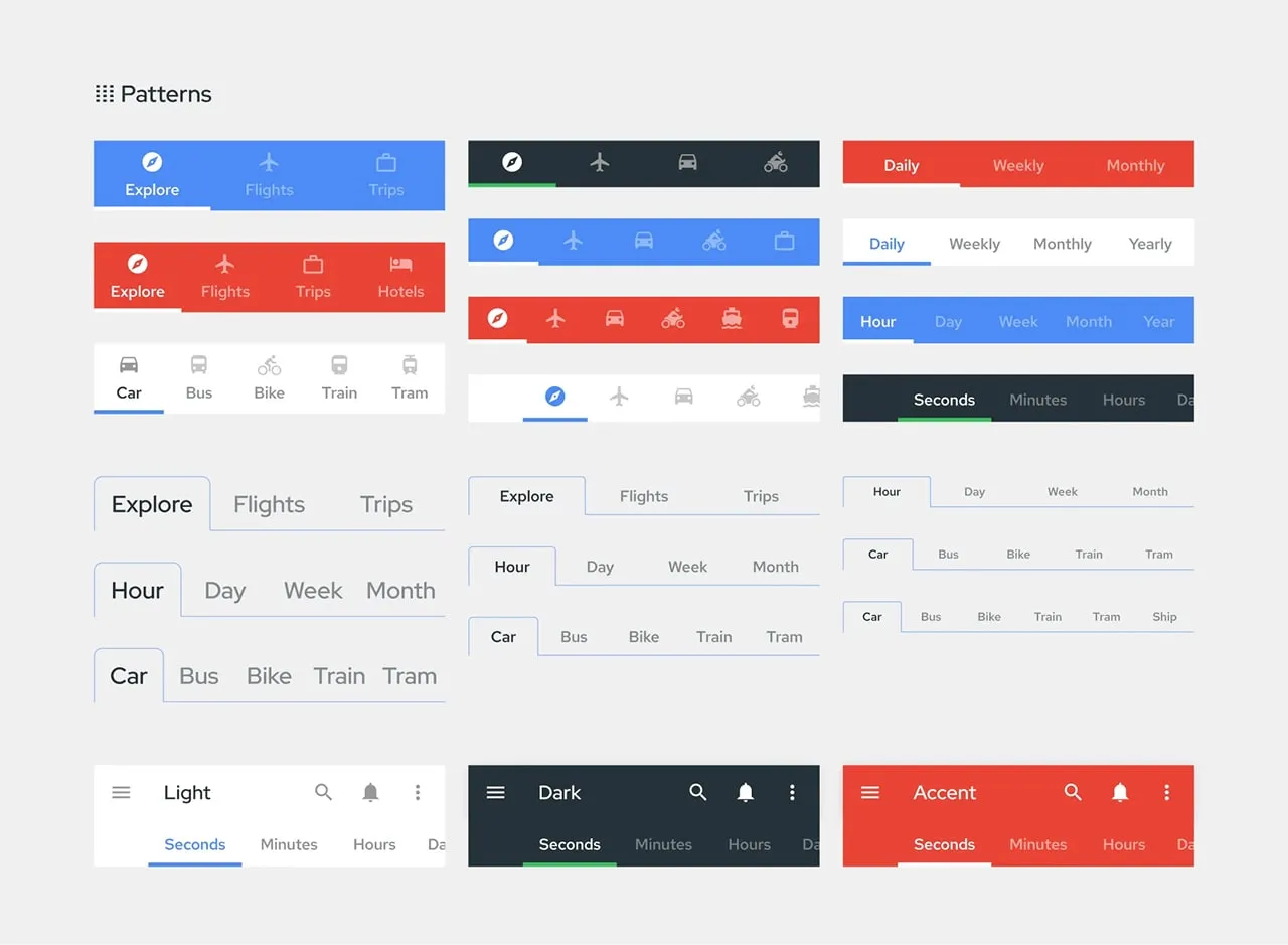
Types of tabs
Standard horizontal tabs
Variations of navigation Tabs from Material Design System
Reach for these when you have 2-5 categories that deserve equal prominence. Divide the container width by the number of tabs to size each one, but don't let any tab fall below 96px. Under 480px, switch to a scrollable bar with 16px of horizontal padding.
Vertical tabs
Vertical tabs earn their place when categories nest several levels deep, like an enterprise dashboard. Cap the nesting at three levels and let the third level collapse into dropdowns. Sitting them a little in from the left edge suits the F-shaped way people scan.
Icon-only tabs
Icon-only tabs are for tight spaces: mobile apps, wearables, kiosks. Because the glyph carries the whole meaning, pair it with hover tooltips and ARIA labels so it stays accessible. Keep the touch target at least 48x48px with the icon itself around 24-32px.
Segmented control tabs
iOS segmented controls variations included in Figma iOS UI kit
Segmented controls fit binary or ternary choices where only one option can be true at a time. Fill the segments, round the corners a touch, and flip the colors on the active segment so the current state is obvious. Keep labels to a word or two: "Dark Mode" becomes just "Dark" here.
Scrollable tabs
Once you're past six categories that all deserve equal weight, make the row scrollable. Let the edge of the next tab peek into view as a hint of more, and add momentum scrolling with snap points. For right-to-left languages like Arabic, mirror both the scroll direction and the chevrons.
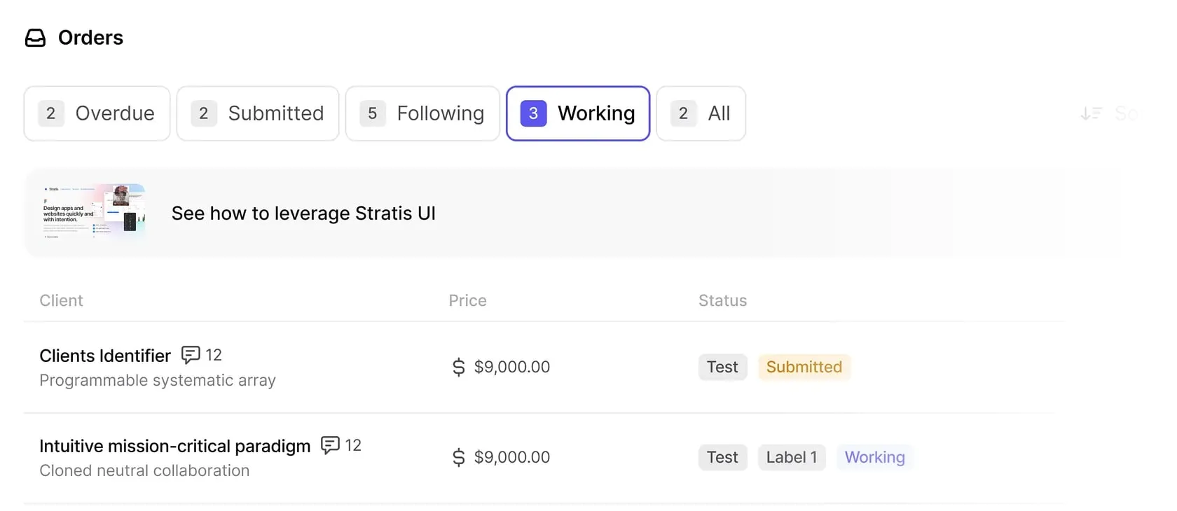
Dynamic tabs
Dynamic tabs are the browser model: people open and close them on the fly. Give the "+" button a little breathing room past the last tab, and animate a closing tab out so it doesn't just blink away. Keep the last few closed tabs in memory too, so a misclick is one undo away rather than a dead end.
Stratis UI tabs from task management dashboard by Monty Hayton
Tabs vs dropdown vs accordion vs segmented control
Before you reach for tabs, check that the pattern actually fits. The four controls below all switch between sections, but they answer different constraints: how many options you have, whether one or many can be open, and how much room you have on screen.
| Tabs | Dropdown | Accordion | Segmented control | |
|---|---|---|---|---|
| Best for | 2–6 peer sections | 7+ options or rare actions | Stacked sections on narrow screens | 2–4 mutually exclusive options |
| Visible options | All at once | Hidden until opened | All headers, one body open | All at once |
| Screen space | One horizontal/vertical strip | Almost none until opened | Grows as sections expand | Compact pill |
| One open at a time | Yes | Yes | Optional (single or multi) | Yes |
| When to use | Options fit on one row, only one view shown at a time, sections are equal peers | Too many options to show inline, or the choice is occasional | Vertical space is cheap, horizontal is not, users scan top to bottom | A short, fixed set of exclusive choices (view toggles, light/dark) |
| Mobile friendliness | Good if scrollable; risky if they wrap | Good (saves space) | Good (vertical by nature) | Good (thumb-sized) |
If your options do not fit on one row and only one view is ever visible, tabs are the right call. Once you pass six, or the choice is rare, move to a dropdown; when vertical space is the only space you have, reach for an accordion.
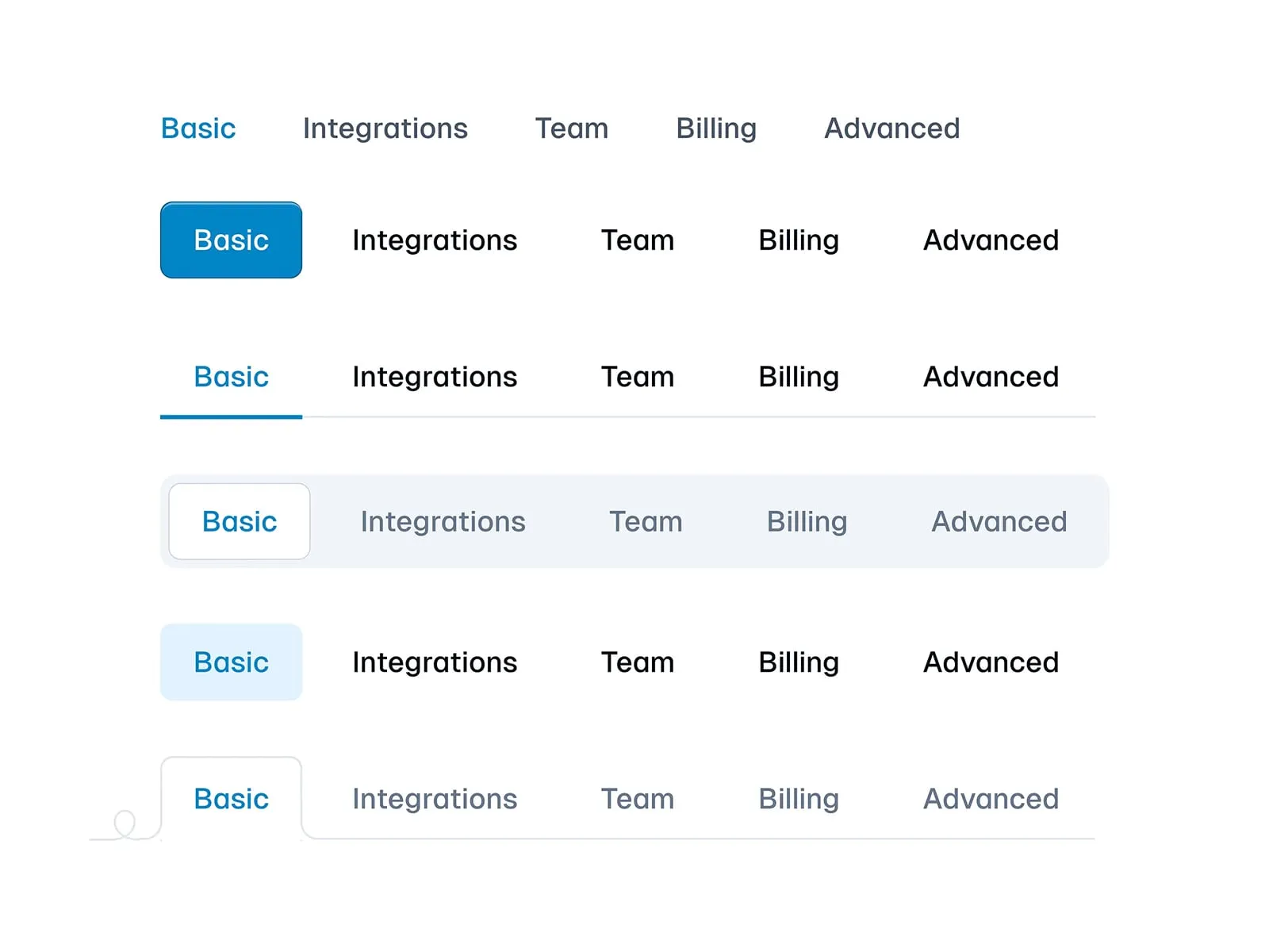
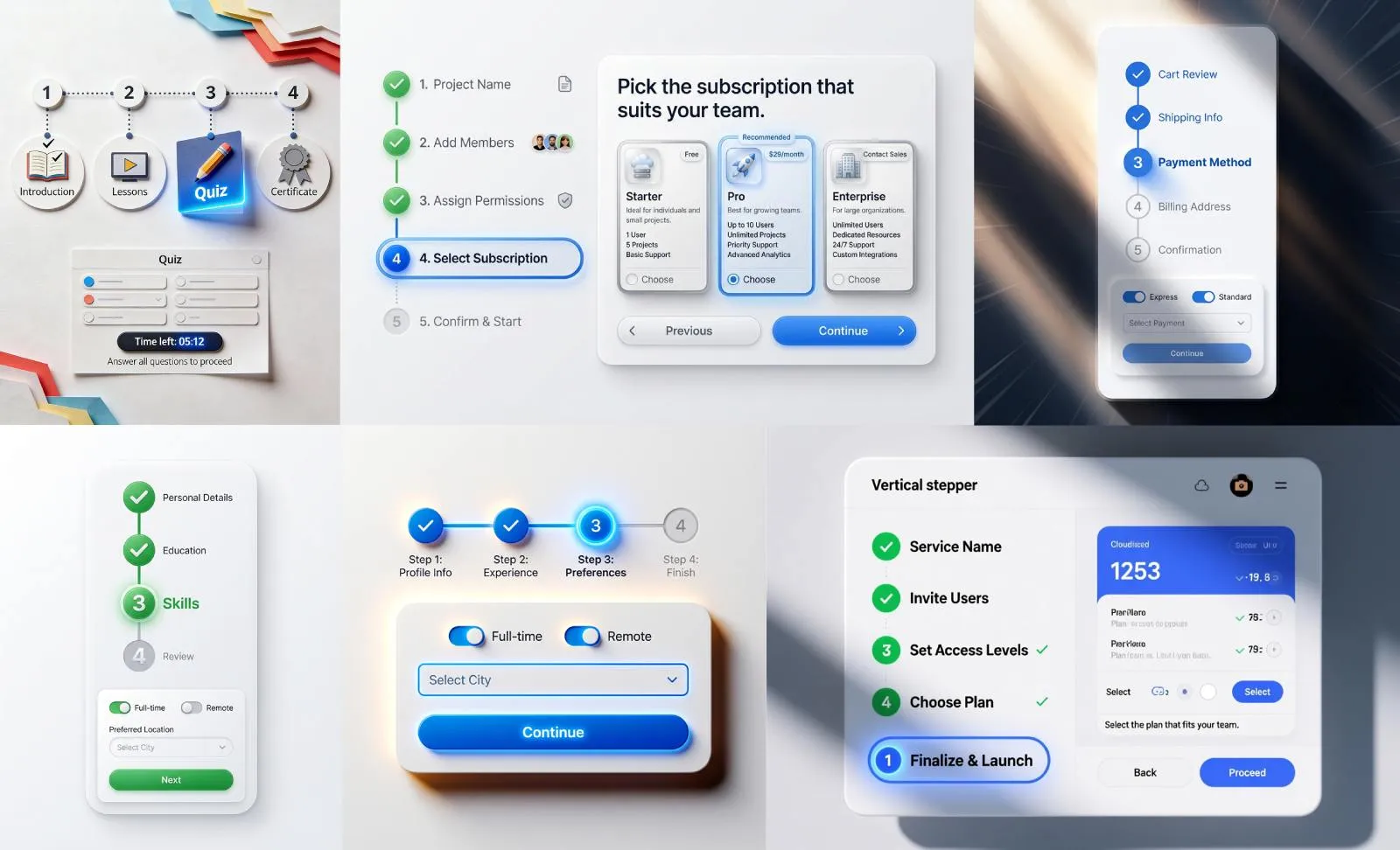
Tabs states
Default state
Initial render: First tab active by default unless user context suggests otherwise.
Exception handling: In multi-page forms, preserve active tab through navigation.
Design fault: Avoid "ghost tabs" - every tab must have associated content.
Hover state
Interactive tabs in action. Components included in Figma React UI kit
Discoverability boost: Lift the tab slightly with a soft shadow on hover.
Microcopy opportunity: For icon tabs, display tooltip after 400ms hover duration.
Accessibility parallel: Match hover styles with keyboard focus states.
Active state
Visual hierarchy: Combine 3 techniques minimum - color change, indicator movement, typographic shift.
Content transition: Cross-fade panes over 300ms with 100ms overlap. Never use slide animations - causes spatial disorientation.
Disabled state
Temporal restriction: When tabs require prior actions (e.g., payment completed).
Visual treatment: Reduce the tab to a muted, low-opacity state and remove the pointer cursor so it reads as unavailable.
User guidance: On disabled tab click, display toast message explaining requirements.
Focus state
Segmented controls in action. Outline theme included in Figma React UI kit
Keyboard navigation: Show a clearly visible focus ring that meets the WCAG 3:1 non-text contrast minimum against its background.
Screen reader sync: ARIA selected attribute must update within 50ms of visual change.
Advanced technique: Programmatic focus follows natural tab sequence, ignoring disabled elements.
Error state
Validation feedback: When tab content contains invalid entries or requires user attention.
Visual signal: Mark the tab with an error color and a persistent badge (a small red dot works well) so the problem stays visible after the user looks away. Skip shaking or flashing the whole tab: it reads as noise, not guidance.
Accessibility layer: Trigger ARIA live regions to announce errors immediately. Combine with aria-invalid="true" on the tab element.
Loading state
Content fetching: When tab data requires asynchronous loading.
Perceived performance: Use a shimmer effect on the content pane while data loads, and show a centered progress indicator if the wait runs long.
Fallback strategy: After 3 seconds, show partial content with the "Load More" button. Never block tab switching - allow access to pre-loaded sections.
Tabs theming
Rounded tabs
Rounded tabs UI design theme by Erdem
Visual signature: Softened corners (4-12px radius) with filled backgrounds.
Best for: Brand-forward apps, wellness platforms, and interfaces targeting younger demographics.
Styling parameters:
- Active tab: 8px radius, #2A2A2A fill, 1px inset shadow
- Inactive tabs: 4px radius, #F8F8F8 fill with 0.8 opacity
- Transition: Radius morphs from 4px→8px over 200ms
Why it works: Rounded shapes evoke approachability, making them ideal for onboarding flows and mental health apps. The morphing radius subtly directs attention to selections without aggressive animations.
Underlined tabs
Underline tabs UI design theme by Sebastiano Guerriero
Visual signature: Minimalist text labels with dynamic underlines.
Best for: Content-heavy interfaces (CMS, documentation portals) where screen real estate is precious.
Styling parameters:
- Active underline: 3px height, animated from left-to-right
- Inactive state: 1px #EEE underline (visible on hover only)
- Typography: 16px system font with 500 weight for active
Why it works: The animated underline creates a "progress bar" effect, subconsciously guiding users through navigation steps. Its simplicity prevents visual competition with content.
Segmented control tabs
Segmented control tabs UI design theme by Pixsellz
Visual signature: iOS-style pill-shaped containers with filled segments.
Best for: Mobile-first experiences, settings panels, and binary choices (e.g., light/dark mode).
Styling parameters:
- Container: 8px radius, #F3F3F3 background
- Active segment: #FFFFFF fill with 2px border
- Spacing: 2px gap between segments
Why it works: Mimics native OS patterns, reducing cognitive load. The filled segment acts as a physical "slider," reinforcing mutual exclusivity of options.
Elevated tabs (Material X)
Elevated tabs UI design theme from Material-X UI kit for Figma
Visual signature: Floating tabs with shadow elevation and iconography.
Best for: Data dashboards, enterprise software with complex navigation.
Styling parameters:
- Active tab: 8dp elevation, 12px icon padding
- Inactive tabs: 1dp elevation, 60% opacity
- Indicator: Floating underline detached from text
Why it works: Shadows create z-axis depth, helping users mentally map hierarchical relationships between tabs and content. The upward lift on active states mimics physical button presses.
Borderless tabs
Borderless tabs UI design theme by Jon Moore
Visual signature: Seamless integration with background, using color shifts only.
Best for: Minimalist portfolios, artist websites, and interfaces with full-bleed imagery.
Styling parameters:
- Active tab: noticeably heavier label weight, faint background tint
- Hover effect: 0.05 opacity overlay
- Divider: 1px dashed line between tabs
Why it works: Eliminates visual clutter, allowing imagery/typography to dominate. The weight transition (via variable fonts) maintains hierarchy without traditional UI chrome.
Tabs use cases
Dashboard navigation (Google Analytics 4)
Learn how to design the ideal dashboard navigation by applying Tabs nested into the Application bar
Problem: Users get lost in complex metric trees.
Solution: Three-tier tab system:
- Primary tabs (Reports, Explore, Configure) – Fixed top bar
- Secondary tabs (Real-time, Audience, Acquisition) – Underlined style
- Tertiary date filters – Segmented control
E-commerce filtering (Amazon product search)
Problem: Overwhelming product options.
Solution: Hybrid scrollable tabs:
- Default visible: "Department", "Price", "Rating"
- Hidden behind "More" tab: "Sustainability", "Certifications"
- Keep the "More" tab manually triggered — auto-expanding it on a timer tends to surprise people mid-scan
Mobile app navigation (Instagram stories)
Problem: Content overload in Stories feed.
Solution: Icon-only circular tabs:
- Active story: Radial progress indicator
- Viewed story: 50% opacity + checkmark overlay
- Tap targets sized for thumbs, so the next story is one easy tap away
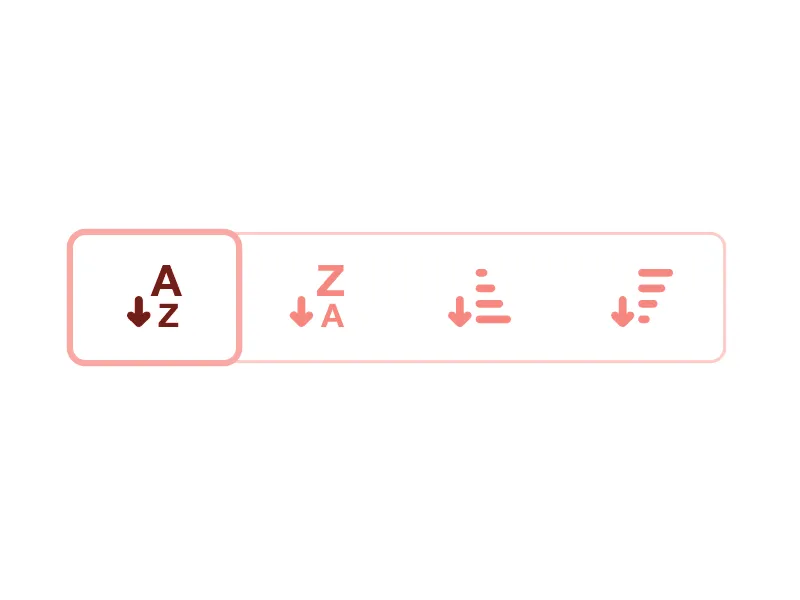
Enterprise settings (Slack workspace admin)
The app settings tutorial is a designated area where users can customize and adjust various preferences, options, or configurations
Problem: Buried configuration options.
Solution: Vertical nested tabs:
- Parent tabs (Settings, Permissions, Billing) – Left rail
- Child tabs (Channel Defaults, Member Roles) – Indented + smaller font
- Grouping related settings under one parent tab keeps admins from hunting across screens
Media consumption (Netflix profile selection)
Problem: Accidental profile switches.
Solution: Hover-activated tab cards:
- Resting state: Profile icons only
- Hover: Animated expansion with name + watch progress
- The expand-on-hover delay gives people a beat to confirm the right profile before committing
Before you ship: tabs checklist
Run through this before you call a tab component done. Most tab bugs are not visual, they show up in keyboard, focus, and what happens the moment someone switches.
- ✅ Exactly one tab is active on load, and its state is obvious at a glance.
- ✅ Arrow keys move between tabs; Home and End jump to first and last.
- ✅ The active tab carries
aria-selected="true"and panels are tied to tabs witharia-controls. - ✅ The focus ring is visible and meets WCAG 3:1 non-text contrast, never relying on color alone.
- ✅ Overflow is handled: tabs scroll with a peek of the next item, they do not silently wrap into a second row.
- ✅ No ghost tabs: every tab points to real content, nothing dead-ends.
- ✅ Touch targets are at least 48×48px so thumbs do not miss on mobile.
- ✅ Content height stays stable on switch, so the page does not jump as panels swap.
- ✅ The indicator and label weight both signal the active tab, so it reads without color vision.
- ✅ On a fresh reload, the right tab is restored when context demands it (a multi-step form, a deep link).
UX and usability tips
Purposeful micro-animations
Tabs component from Figma & React library. Ready-to-use components styled and UI matches with code
Problem: Abrupt tab transitions disorient users.
Solution: Use animations to bridge visual gaps between states.
Example: Figma’s prototype panel employs a 250ms slide-and-fade effect when switching between "Design" and "Code" tabs, creating spatial awareness.
Design tips:
- Animate the active indicator with transform: translateX() for horizontal tabs.
- For vertical tabs, slide content panels upward/downward with ease-in-out timing.
- Avoid over-animating; keep durations under 300ms to prevent perceived lag.
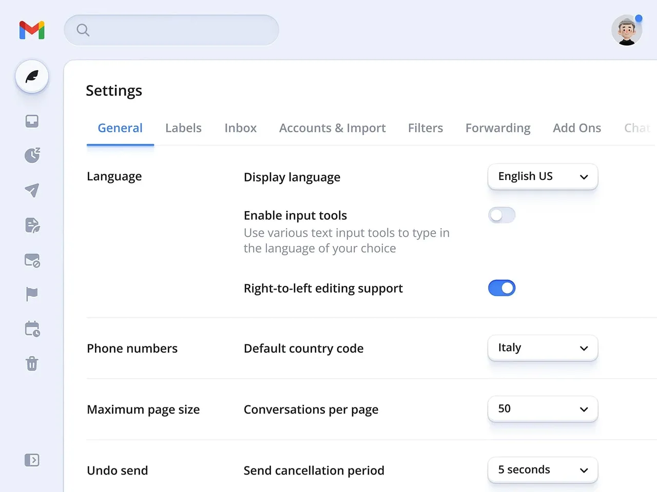
Granular keyboard navigation
Problem: Keyboard users struggle to navigate tabs with nested menus.
Solution: Map complex hierarchies to intuitive key combinations.
Example: Gmail’s settings tabs use Arrow keys →/← for parent tabs and ↑/↓ to navigate sub-tabs like "Themes" or "Inbox."
Design tips:
- Assign aria-controls to link tabs to their content panels for screen readers.
- Let users press Tab to jump between interactive elements within a tab’s content.
- Add :focus-visible styles to avoid intrusive outlines for mouse users.
Overflow logic and scroll controls
Problem: Hidden tabs frustrate users who can’t find rarely used options.
Solution: Dynamically adjust overflow based on viewport size and user behavior.
Example: Notion’s database tabs show horizontal scroll arrows only when content overflows, with a gradient fade at the container’s edge to hint at more options.
Design tips:
- Use Intersection Observer API to detect overflow and render scroll controls.
- For touch devices, enable swipe gestures but keep arrows for discoverability.
- Prioritize "pinned" tabs (e.g., frequently used) in auto-collapse algorithms.
Smart badges for multi-layer events
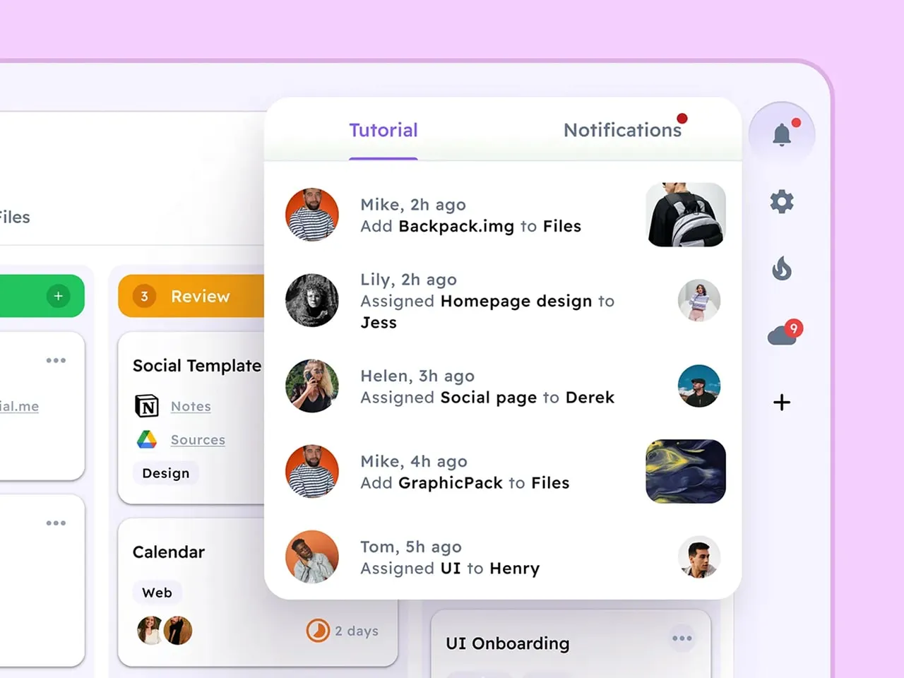
Example of how smart badges could be applied with Tabs. Learn more in Notifications tutorial
Problem: Users miss time-sensitive actions buried in sub-tabs.
Solution: Cascade badge notifications across parent and child tabs.
Example: Slack’s workspace tabs show red badges for unread channels, while nested thread tabs display a dot indicator for new replies.
Design tips:
- Use tiered badge styles: numbers for parent tabs, dots for child tabs.
- Automatically clear badges when users view the parent tab (even if sub-tabs remain unopened).
- For GDPR compliance, avoid badges based on sensitive data (e.g., "3 new messages").
Contextual tooltips for icon-only tabs
Variation of a Tooltip popping out after onHover. Check this dashboard template by Material-X for Figma
Problem: Abstract icons confuse users unfamiliar with the interface.
Solution: Display tooltips on hover/focus to clarify tab functions.
Example: Microsoft Teams’ vertical sidebar shows text labels on hover for tabs like "Activity" (bell icon) or "Files" (folder icon).
Design tips:
- Delay tooltips by 500ms to avoid accidental triggers.
- For touch devices, show labels after a long press (1+ second).
- Use aria-label for screen readers to announce tab purpose without visual clutter.
Tabs UI design FAQ
When should I use tabs instead of a dropdown or accordion?
Use tabs when you have a small set of peer sections (roughly two to six) that fit on one row and only one is visible at a time. A dropdown is better when options are many or rarely used, because hiding them keeps the interface calm. An accordion wins when vertical space is plentiful but horizontal space is tight, like a long mobile form. The quick test: if a person needs to compare or jump between sections often, tabs keep that switching fast and visible.
What is a tab view, and how is it different from web tabs?
"Tab view" is the term iOS and SwiftUI use for the bottom tab bar that switches between top-level app sections. It is the same mental model as web tabs, with two differences: it usually lives at the bottom for thumb reach, and each tab represents a whole destination rather than a panel inside one page. On the web, tabs more often sit inside a page and swap a content pane. Same pattern, different placement and scope.
How many tabs are too many?
On desktop, more than six equal tabs in one row starts to crowd and the labels fight for space. On mobile, four to five is a practical ceiling before targets get cramped. Past that, you have two honest options: make the row scrollable with a peek of the next tab, or step back and ask whether some of those sections belong in a dropdown or a separate page. Hiding the overflow behind a vague "More" tab is usually a sign the structure needs rethinking, not a wider tab bar.
How do I make tabs accessible (keyboard and screen reader)?
Give the tab list role="tablist", each tab role="tab", and each panel role="tabpanel" tied back with aria-controls. The active tab gets aria-selected="true". Arrow keys move between tabs, Home and End jump to the ends, and the focus ring must be clearly visible at WCAG 3:1 non-text contrast. Never signal the active tab with color alone: pair it with an indicator and a heavier label so it still reads for color-blind users.
How do Material Design tabs differ from iOS tabs?
Material Design tabs usually sit near the top, under the app bar, and mark the active tab with a moving underline indicator and a ripple on tap. iOS leans on a bottom tab bar (the tab view) with an icon plus label, where the active item is shown through tint color and a filled glyph rather than an underline. Material is more motion-forward and top-anchored; iOS is quieter and built around thumb reach at the bottom. Match the platform your users already live in rather than mixing both.
Should tabs be scrollable or wrap on mobile?
Scroll, do not wrap. Wrapping tabs into a second row breaks the one-line mental model and makes the active row ambiguous. A single scrollable strip with a hint of the next tab peeking in keeps the pattern intact and tells people there is more. Add momentum scrolling and snap points so a tab never gets stranded half-cut at the edge, and mirror the direction for right-to-left languages.
Where should the active tab indicator go?
Put it on the edge that touches the content. For top horizontal tabs that means an underline along the bottom of the active tab, sitting right above its panel, so the eye connects tab to content. Vertical tabs take the indicator on the inner edge facing the pane. Keep it consistent, animate it sliding between tabs rather than blinking, and make sure it is not the only signal of selection.
A last word on tabs
Tabs are one of those components everyone thinks they understand until they ship one. The visual part is easy. The hard part is everything around the switch: the keyboard order, the focus ring nobody styled, the panel that jumps two pixels every time you change sections. Get those right and a tab bar disappears into the background, which is exactly what it should do. My advice: build the boring version first, the one that works with a keyboard and reads without color, then add the polish. A tab that quietly does its job beats a beautiful one that loses people on the second click.


