

Roman Kamushken
When to redesign a checkbox
When examining ways to improve the UX of your web app, start with a single component! By tweaking Chakra UI checkbox styles, colors, and states, you can achieve a faster response, better accessibility, and a more satisfying overall UI design lift-up.There are several parameters to modify for a checkbox that affect it's UI design. By combining the check icon shape, it's color; or adjusting the whole container corners radius, shadows, and background – you achieve UI performance, reduce user delays and pivot the whole web application to more clear, accessible, and modern.
Here are the params we are going to twist today:
- Container corner radius
- Check icon redesign
- Background states style
- Color themes
All further CSS customizations are based on several aspects to modify: BG color, corners, border, and shadow. By mixing and styling them you will achieve visual harmony, a slick experience, and an overall user positive attitude to your app.
Let's get to it.
Corners radius
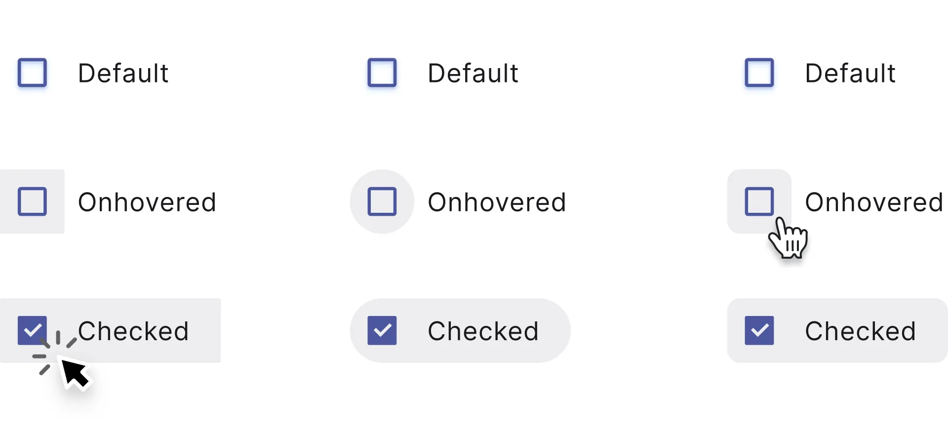
Adjusting corner radius value is the key to quickly change a checkbox container look, especially when the component is checked, or hovered.
When a checkbox set to selected, by filling down the whole container we can additionally highlight the change of state. Shaded grey, blue or indigo color makes the container visible, so we can manage corners to configure components shape.
Experimenting with corners makes it easy to fit a checkbox component with a proximity of your particular interface UI. For example, highly-rounded corners will be a best fit for the same rounded visual scheme, on the other hand tiny-rounded shapes is a kind of standard for enterprise GUIs. Where is a button may look like a brick, and you should keep this consistent for checkboxes either (e.g. border-radius: 0-2px).
See how background expands and wraps a caption when a checkbox is clicked? When a text label is hovered it makes obvious for the user – clicking here will toggle the checkbox state as well. A caption involved into the action.
Play with corners for your own by editing radius, controlRadius values:
Checkbox.js
Checkbox redesign
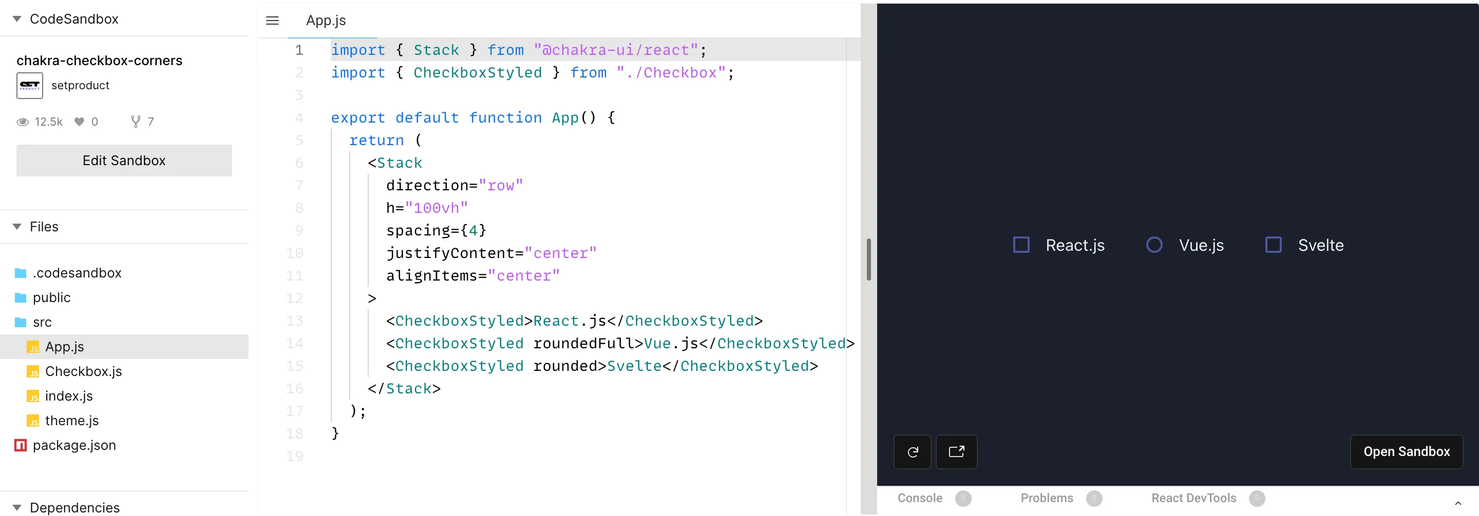
There is no outcome redesigning checked/unchecked icons for the vast of majority cases. The user knows – an icon checked means a confirmation of conditions changed. When a checkbox appears, it means everything is OK, and the new state is confirmed. Any other icons instead of ✓ may confuse.
However, in the world of GUIs (especially from the recent past), you can observe various metaphors to correspond to the active checkbox state. Rounded checkbox, donut-like, squared, outlined, and others.
Stay between the default checkbox and circle-shaped so as not to confuse users, unless your app UI design requires exclusive styles or uncommon solutions.
For example, squared checkboxes are commonly used for enabling/disabling, while rounded is more utilized to represent multiple selections (e.g picking several properties when filtering). So, your final choice must be based on a checkbox use case.
Styled background
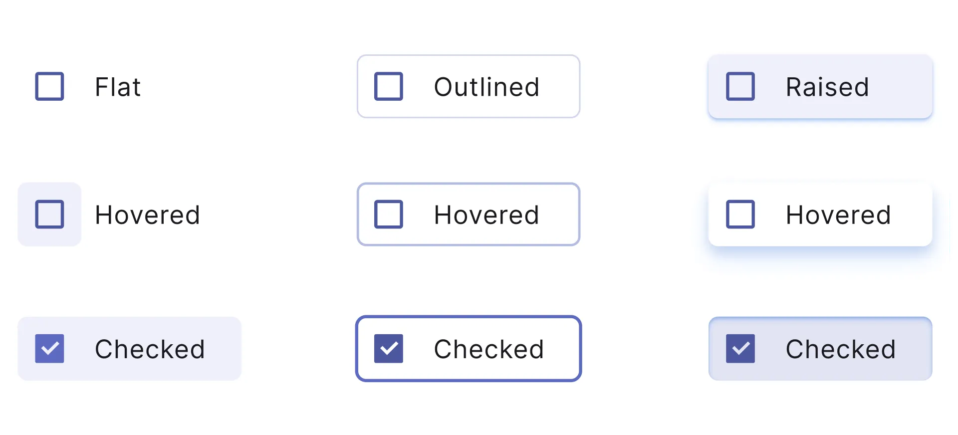
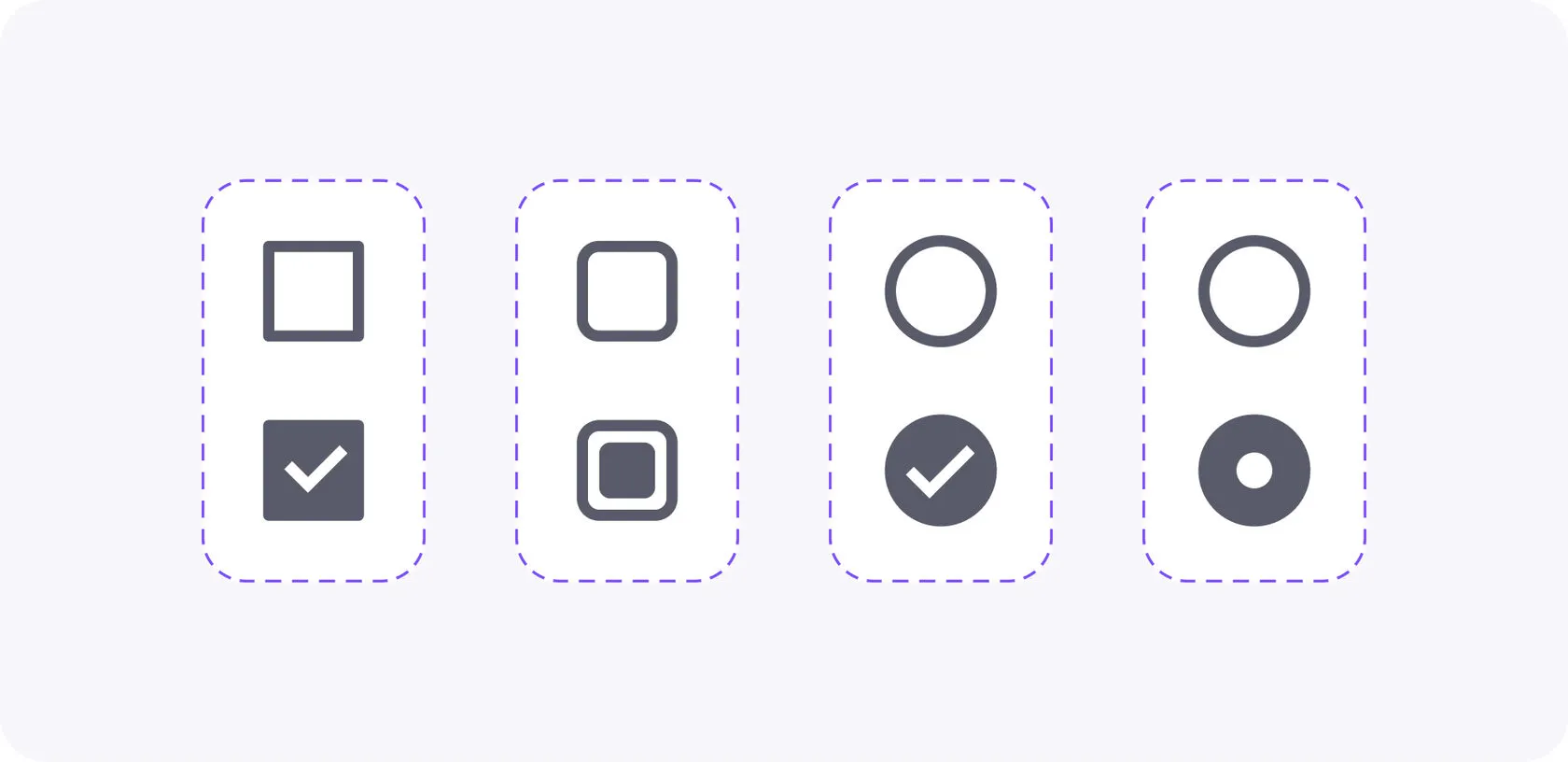
To make it more obvious for a user to distinguish checked items from unchecked you can apply styles to a container background, mainly when it's hovered, or clicked. When you're highlighting a checkbox active state, thus the items are now additionally separated, and styled hover makes it explicit to divide elements.
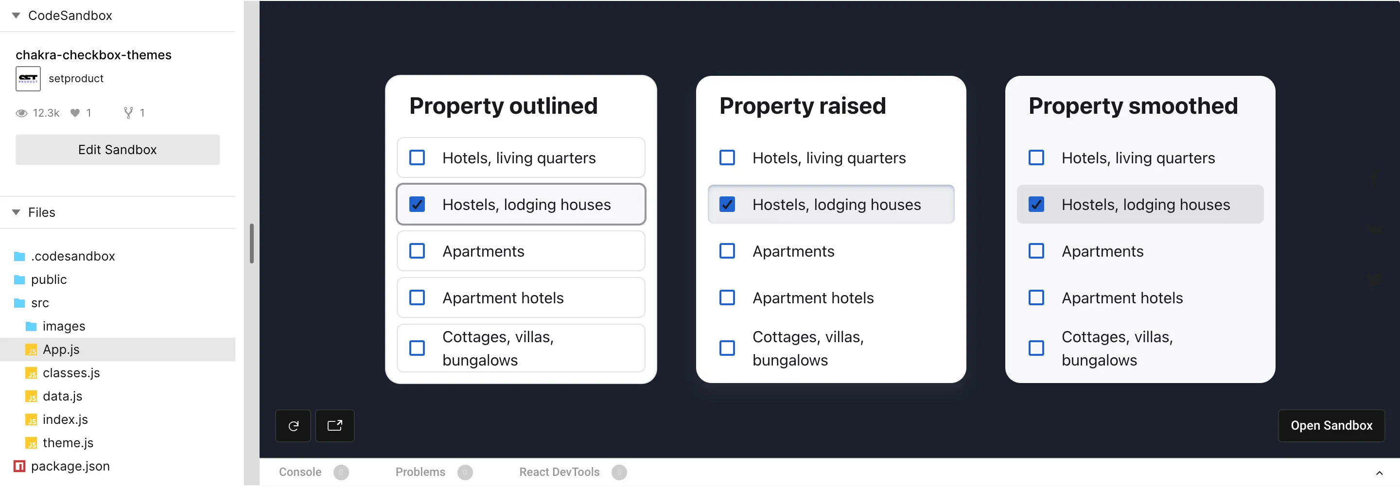
Wrap selected states with a border (Outlined) to intense a selection performed. Equip with a shadow (Raised) to make it look like a clickable button. Fill a background (Smooth) with shaded colors to use on white, or colored surfaces. Picking a proper style depends on UX results you want to achieve.
Styling a checkbox background is a path to endorse usability and highlight what matters most now in your GUI. However, some basic design skills are required to generate modern & user-friendly themes. The vast of cases recommend staying with a trustworthy combination: an ordinary checkbox + simple text together.
Play with styled checkboxes below (Outlined, Raised, Smooth):
Color themes
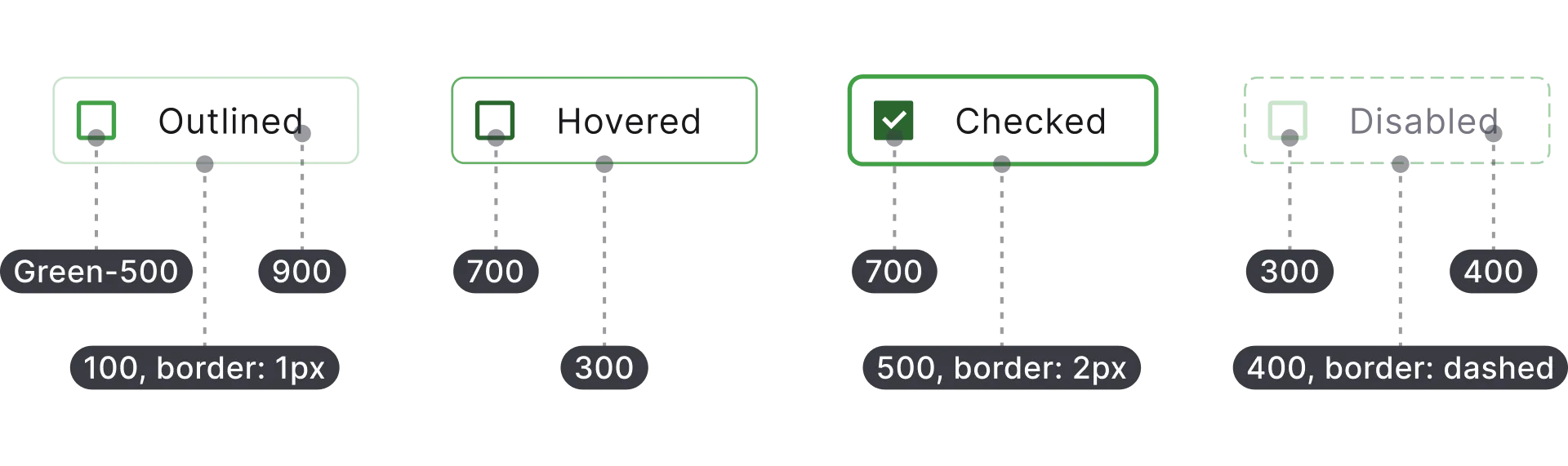
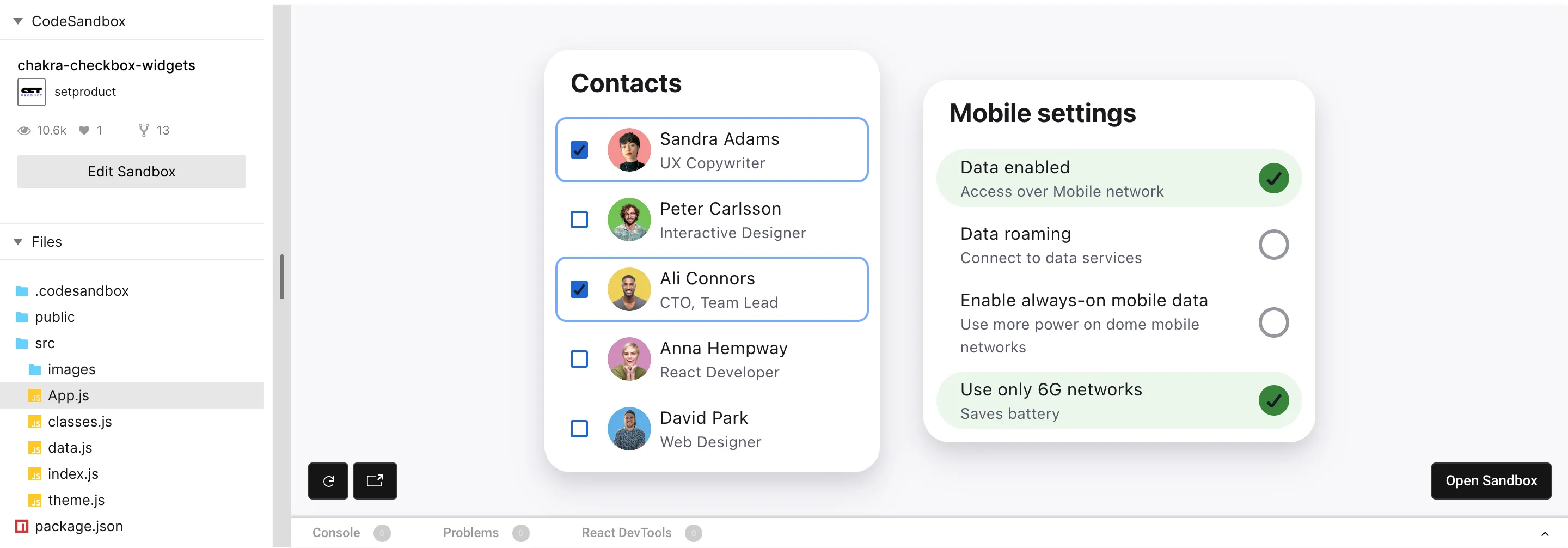
Swapping color themes for the checkbox component is easy within the color tokens. There are 10 tokens for each color in the Chakra palette. Each color is numbered: the higher the value – the darker is color. Overall, Chakra's colors are well-set and good to go with, taking off the headache to compound a palette for your next app UI.
To calibrate a component and prepare it for the themification you have to set proper color token values for each element the checkbox consists of an icon, text caption; hover, active, and other states. And this requires UI design skills and precise attention to UI details.
The image above shows an example of tokens specifications. After, by toggling color names (e.g Green→Blue→Purple) but keeping values you can easily recolor a checkbox in Chakra UI.
Why change checkbox colors, in general? In many cases you don't need to tune it deeply, however, you can't avoid using red for warning states, yellow for caution, and green for success. In order to highlight or diversify blocks, complex components, or even full app sections, you're free to use wisely Grey, Purple, Cyan, or other colors.
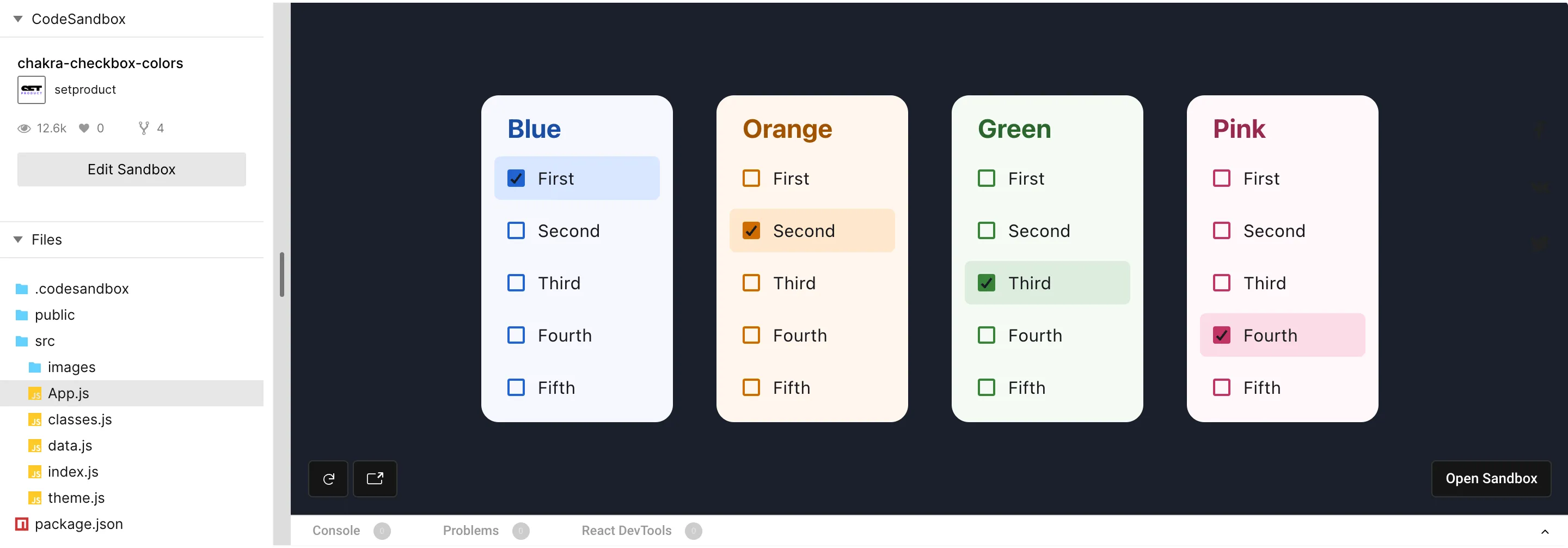
To learn how to store color tokens in React, open the data.js section. You will discover each color named as it is and consists of several values declared internally. This makes styling effortless with component props:
Data.js
Conclusion
A component deep themification is a key to achieve a slick UI and smooth user's experience, but UI design intermediate skills are required here. A visual designer calibrates specs for each tiny detail for a component, then a developer carefully convert those styles into code.
So, let's get through a crucial points once again:
-
Experimenting with separate parts of a component makes it easy to fit a checkbox component with a proximity of your particular interface UI.
-
It's safe to stay with the default checkbox icon as it is acquainted for users, unless your app UI design requires exclusive styles or uncommon solutions.
-
To make it easier for a user to distinguish checked items from unchecked you can apply styles to a container background, mainly when it's hovered, or clicked.
-
In order to highlight or diversify blocks, complex components, or even full app sections, you're free to use wisely Grey, Purple, Cyan, or other colors.
The ideas given in this post might be useful for designers who code (and learn React) and developers who aimed for a polished interfaces, as our coders are. Learn more about our services, if you're looking for a team of professionals dedicated to design & code beautiful components and web apps. Figma, Webflow, React, Angular and other stacks are not only we're capable of. Hire us!


