


Stan Suboticki
Small business websites occupy a strange corner of web design. The stakes are genuinely high, because for most of these companies, the website is the primary sales channel but the people making design decisions aren’t designers. They’re electricians, attorneys, consultants, and contractors who know their trade inside out but have never thought about visual hierarchy or tap target sizes.
After 13+ years of building WordPress sites for small businesses, I keep seeing the same UX failures. Not edge cases or exotic usability problems. Fundamental decisions that get made wrong early and then quietly cost the business conversions and clients/customers for years. The site looks “fine”, nobody complains. But the contact form barely gets used, the bounce rate stays high, and the owner assumes the website just doesn’t work for their industry.
It almost always does. The UX is just working against them. Here are the decisions that make the difference.
The Hierarchy Problem: When Everything Is Important, Nothing Is
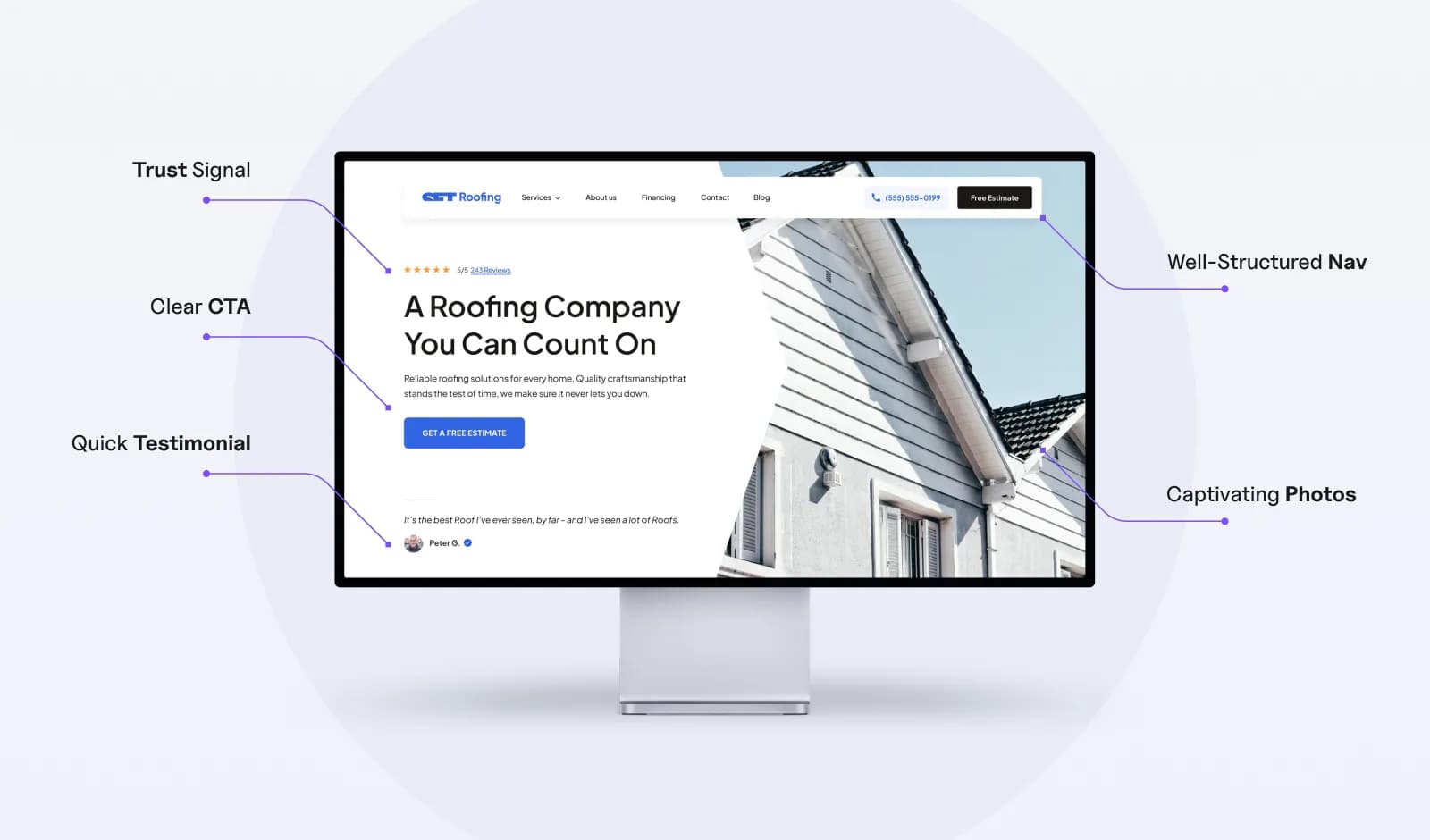
Small business owners tend to approach their homepage like a brochure. Every service, every credential, every phone number needs to be visible immediately. The result is a flat layout where nothing stands out because everything is competing for attention at the same volume.
Visual hierarchy is the single most important UX principle on a service business website, and it’s the one that gets broken most often. When a visitor lands on a page, their eyes need somewhere to go first. A primary headline, a clear value statement, one obvious next step. If the page presents eight services, three phone numbers, a Google Maps embed, a testimonial carousel, and a “We’re Hiring” banner all within the first viewport, the visitor’s brain doesn’t prioritize. It bounces.
The fix sounds simple but requires real discipline: one primary action per section. The hero gets a headline and one CTA. The services section introduces what you do without trying to explain every offering in detail. The testimonial section builds confidence. Each section has a job, and when a section tries to do two jobs, it does neither well.
Research consistently shows that users form an impression of a website in under a second. In that window, they’re not reading your copy. They’re scanning for structure. If the structure tells them “here’s what we do, here’s proof we’re good at it, here’s how to contact us,” they stay. If the structure says “here’s everything all at once,” they leave.
Trust Signals in the Wrong Place
Most small business websites fall into one of two camps with social proof. Either they have none at all, or they dump everything into the footer: a Google rating, a BBB badge, three testimonials, and a row of partner logos that nobody ever scrolls down to see.
The problem isn’t a lack of trust signals. It’s placement. Trust elements work when they appear at the moment a visitor is deciding whether to take action. A testimonial positioned next to a contact form reduces the anxiety of submitting personal information right when that anxiety peaks. A Google review badge sitting in the footer does almost nothing because the visitor who needed that reassurance already bounced two screens ago.
There’s also a difference between decorative credibility and functional credibility. Scattering logos across the page with no context is decorative. Placing a specific client testimonial that mentions a measurable result directly below your service description is functional. One looks nice. The other actually influences behavior.
The best small business sites treat trust signals the same way they treat CTAs: placed with intention at specific decision points throughout the page, not clustered in a single section. A short testimonial near the hero. A review count beside the pricing. A case study reference near the “schedule a call” button. Each one does a job at the moment it matters most.
This kind of intentional placement rarely happens on a one-and-done project. It requires a dedicated web design team that understands how visitors actually move through the site and can adjust based on real behavior over time.
A notable issue with trust signals such as TrustAdvisor, BBB on small business websites, apart from the positioning, is also lack of adherence to official brand guidelines - so you will find stretched, distorted or semi-visible logos, which in my opinion hurt the credibility more than they contribute to it.
Navigation That Solves the Wrong Problem
A seven-page service business website does not need a dropdown menu. It definitely doesn’t need a mega menu. And yet, small business sites routinely ship with navigation patterns borrowed from e-commerce stores or SaaS platforms with hundreds of pages.
The instinct makes sense. Complex navigation feels professional, like the business is big enough to need it. But for a site with a homepage, an about page, three service pages, and a contact page, that complexity just adds friction. Every extra click, every nested submenu, every hamburger icon hiding visible links on the desktop is a small barrier between the visitor and the thing you actually want them to do: make contact.
The real navigation question for a service business isn’t “how do we organize all our content?” It’s “how do we get a visitor from landing to contact in two clicks or fewer?” That reframe changes everything. Suddenly the goal isn’t to build an impressive menu structure. It’s to make every destination visible and reachable without thinking.
Flat, fully visible navigation works best for small sites. Every page in the top bar, no dropdowns, no icons replacing labels. The visitor sees the full picture of the site in one glance and picks where to go. It feels simple, and that simplicity is the point. When someone lands on a plumber’s website at 10pm with a burst pipe, they’re not browsing. They need the phone number or the contact form, and the navigation should make that a one-second discovery.
The guiding star at all times should be accessibility, proper structure and conversion optimization.
Mobile as an Afterthought, Not a Starting Point
Over 60% of web traffic now comes from mobile devices. For local service businesses, that number is often higher because people search for plumbers, dentists, and lawyers on their phones while the problem is happening. Despite this, most small business websites are still designed on a desktop monitor and then squeezed onto smaller screens through responsive CSS.
Responsive doesn’t mean mobile-friendly. A button that technically fits on a phone screen but measures 30 pixels wide is responsive. It’s also nearly impossible to tap accurately with a thumb. A contact form that renders on mobile but requires pinch-zooming to read the field labels is responsive. It’s also unusable. Responsive is a technical checkbox. Mobile-friendly is a design decision.
The specific failures repeat across almost every small business site I audit. Hero images that push the first meaningful content below three full swipes. Tap targets smaller than 44x44 pixels, which is the minimum recommended size for comfortable touch interaction. Phone numbers displayed as plain text instead of tap-to-call links. Forms with five fields that could be two. Each one seems minor in isolation. Together, they create an experience that quietly drives mobile visitors away before they ever reach the contact page.
The fix is a process change, not a technical one. Design the mobile layout first. Make every interaction comfortable on a 6-inch screen with a thumb. Then expand that layout for desktop, not the other way around. The businesses that build this way end up with sites that work well everywhere instead of sites that only work well on the screen they were designed on.
The Redesign Trap: Fixing Symptoms Instead of Structure
When a small business website underperforms, the first instinct is almost always cosmetic. New colors. New photos. A trendier font. Maybe a fresh homepage banner. The owner feels like the site looks dated, so they assume a visual refresh will fix the conversion problem.
Sometimes it does. But more often, the real issues are structural. The visual hierarchy is flat. Trust signals are buried. The navigation adds friction. The mobile experience is broken. A new coat of paint on top of those problems produces a site that looks modern and still doesn’t convert. The owner ends up exactly where they started, just with a lighter wallet and a different color palette.
The diagnostic is straightforward. If visitors are arriving but not converting, the problem is almost never aesthetics. It’s information architecture, page flow, and interaction design. The question to ask isn’t “does this site look good?” It’s “does this site make the next step obvious at every point in the visitor’s journey?” If the answer is no, surface-level changes won’t move the needle.
Knowing when a site needs cosmetic updates versus a full structural rethink is one of the harder judgment calls in web design. A practical website redesign guide сan help frame that decision, but the core principle is simple: if the problems on your site map to the patterns described in this article, you’re looking at a rebuild, not a refresh.
The One Decision That Prevents All of This
These UX failures don’t happen because small business owners are careless. They happen because design decisions are being made by people whose real expertise is running a roofing company or managing a dental practice. That’s not a criticism. It’s just a mismatch between the problem and the person solving it.
A roofer doesn’t expect homeowners to inspect their own flashing. An attorney doesn’t expect clients to draft their own contracts. But somehow, small business owners are expected to make complex UX decisions about visual hierarchy, trust signal placement, mobile interaction patterns, and information architecture with no training and no feedback loop telling them what’s working.
The single highest-impact UX decision a small business can make has nothing to do with fonts or color schemes. It’s recognizing that a website is a working tool that needs professional design attention, not just at launch, but continuously as the business evolves and visitor behavior shifts. The businesses that figure this out early build sites that quietly generate leads for years. The ones that don’t keep cycling through redesigns every two years, wondering why nothing changes.
About the Author
Stan Suboticki is the founder of North Pole Digital, where he designs and builds WordPress websites for small businesses across the US. After 13+ years of design experience, he now focuses on creating sites that convert visitors into customers.


.avif)
.avif)
.avif)
.avif)
.avif)
.avif)